Long winding intro
Imagine someone has a computer model of the Earth and its atmosphere. The atmosphere may be represented by a 3-d grid. If we ignore the vertical coordinate, you may have a regular latitude × longitude grid.
Let’s then say you use a related computer model to investigate the effects some emissions have on the atmosphere. And then use those results to estimate the associated impacts this pollution has on human health. You would do so using epidemiological data, which are heavily dependent on healthcare and socioeconomic conditions (among many other factors), and that are produced and compiled at national levels. Can you imagine such a study?
What you would have, in this theoretical scenario, is a need to figure out what country each of your politically ignorant grid cells is in. It seems trivial, but the thing about political borders is that there is always some trouble with edge cases.
In this post I will go over some interesting things I found along the way of making such an assignment of countries to grid cells. There is no “one nice plot”, but rather a collection of small maps that will guide us on a world tour of a selection of country borders.
Where am I?
More precisely, how do you find out the name of a place given its geographical coordinates? Well, there is a fancy name for that: reverse geocoding. To give an analogy that is understood by only a vanishingly small number of people: it’s like looking up a number on the phonebook instead of looking up a name.
I had a regular grid of the globe with a cell every 0.5° in latitude and 0.625° in longitude. At a latitude of around 36° this is equivalent to 56 km by 56 km, if I did the math right. My solution was to reverse geocode the coordinates of the center of each of the cells (the polar cells are half-sized in latitude, hence the 361). To be honest, I actually ignored the North Pole and everything south of New Zealand, but you get the point. I did so using OpenStreetMap through the Nominatim API. For each grid cell, I saved the two-letter code of the country in the address returned by the API.
Yes, country borders don’t quite align with the grid, but I thought that would be good enough. And it kind of was, except for two problems…
The first issue is that a very large number of cells are in remote areas of countries where the reverse geocoding doesn’t return anything. Regions like Siberia, the Amazon, the Sahara, the Outback, and the Arctic Archipelago.
The second issue is that in coastal regions, where a lot of people live, there is around 50% chance that the grid cell center will lay on the water. Sometimes Nominatim would give an (inland) address anyways, but more often than not it wouldn’t give a result.
In hindsight, I should have instead used a dataset of country boundary lines, which should solve the first issue, almost all of the second issue, and be more agnostic to resolution (208 thousand lookups is quite of a lot). I would then check the area of the intersection between each cell and the country borders, or at least check whether the cell is inside a border. However, even with this solution I would still have to deal with the issue of cells containing a border between countries.
Back to what I actually did, my goal was to assign a country to every populated grid cell. You can’t have human health impacts if there are no humans (taps side of head); environmentalists love this one simple trick. So I could just ignore the oceans and other big bodies of water. But because I thought of maybe using these data for other purposes (such as categorizing aircraft emissions by their location), I wanted to fill in the interior unpopulated gaps within countries.
To do this task, I exported the country code data to a CSV file and opened it in Excel. Zooming out revealed a perfectly projected plate carrée world map. This made it easy to manually bucket-fill the large inland gaps.

Resolving the issue of missing data for all populated grid cells, however, would prove to be a bit more laborious. The biggest problem is when one of those lies along the border of multiple countries. My simplistic methodology assigns a single country to each cell, which means I would have to make some choices in those cases.
Population counts
Because of reasons, I was using the LandScan 2019 global population dataset. It contains the population count on a much finer resolution of ~1 km, which I then aggregated into my coarser grid.
It would be easier to assign each grid cell to the country with the most area inside of it. But the more correct approach here would be to give the cell to the country with the largest population within it.
A first plot
This is where today’s plots come in. I wanted to quickly check some edge cases, figure out why the reverse geocoding didn’t return anything, or decide what makes the most sense when a cell lies on the borders between multiple countries.
I made short function using Cartopy that takes the coordinates of the center and some lat/lon margins. The output is a little map with several features: coastlines, country borders, large water bodies, and urbanized areas. The population count for each grid cell and the already assigned country code are printed in front of a semi-transparent white box. Each cell is also (semi-transparently) shaded based on its population.
Here is the first example, Königsberg Калининград:
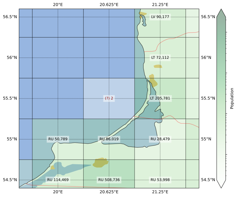
For this figure I left the “problem cell” with no country code, to give an idea of what the assigning process looked like. The remaining plots already show the country codes that were ultimately assigned.
You can see in this first plot that the grid cell center was in the water, but the cell also contains land from two countries. Lithuania was only ever so slightly clipped, so I assigned the cell to Russia. The impact of this was completely insignificant however, as the total population count here was 2 (two).
Going on a world tour
But of course, we I can always do even less useful work. To start off our world tour, the Persian Gulf:
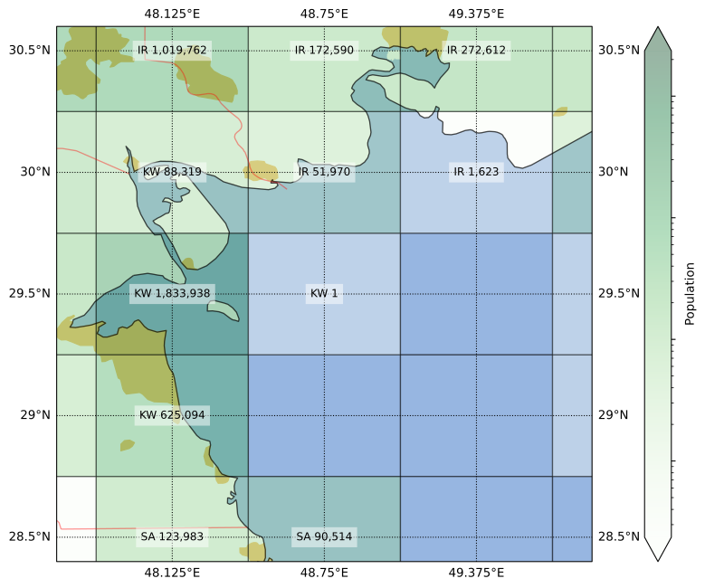
The image actually undersells the situation, as the population counts are rounded up to the nearest integer. The grid cell edges of the native resolution Landscan dataset don’t perfectly align with those on the target grid I’m using, such that sometimes the population in the finer cell is split half-and-half between two coarser grid cells. In the case of the cell at the center of the figure above, the aggregated population totaled ½ person.
Although this area looks completely on water, further inspection shows that it contains some islands too small to show up in the coastlines dataset. From what I can tell, this half-person populates the island of Auhah (Ouha? عوهة؟), owned by Kuwait. Youtube provides a couple of views of what’s like in this far-away* piece of land (*depending on where you are when reading this).
The Landscan population data is produced in part by processing satellite pictures. Despite having no permanent residents (I guess), this small island has a few small shacks, and a convenient heliport. Hence, this is what the pop data looks like:

But sometimes, the island in question has hundreds of thousands more people than that. And it doesn’t always belong to the country with the nearest shores. Our second stop, the island of Bioko, illustrates this:
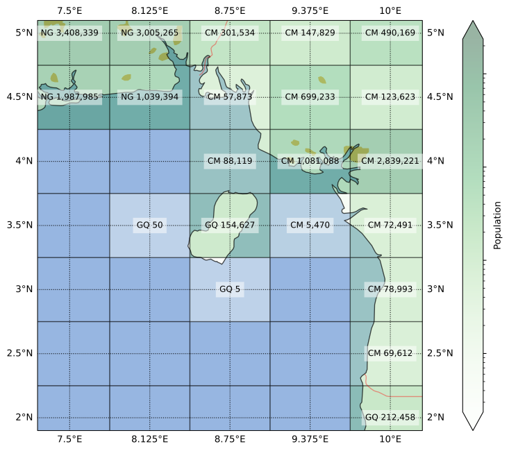
Despite being much closer to Cameroon, Bioko is part of Equatorial Guinea. In fact, until a few months ago, that’s where country’s capital was located, in the city of Malabo. It’s a unique place with a quite interesting history, one that my South-American-educated self was unaware of before this tour.
For example, Equatorial Guinea has the distinction of being the only African country where Spanish is an official language (if you ignore Western Sahara). Although some people in Bioko speak an English-based creole called Pichinglis, due to the complicated history of, hmm, intercontinental migration around the 18th and 19th centuries.
Speaking of intercontinental, our third stop is the strait of Gibraltar:
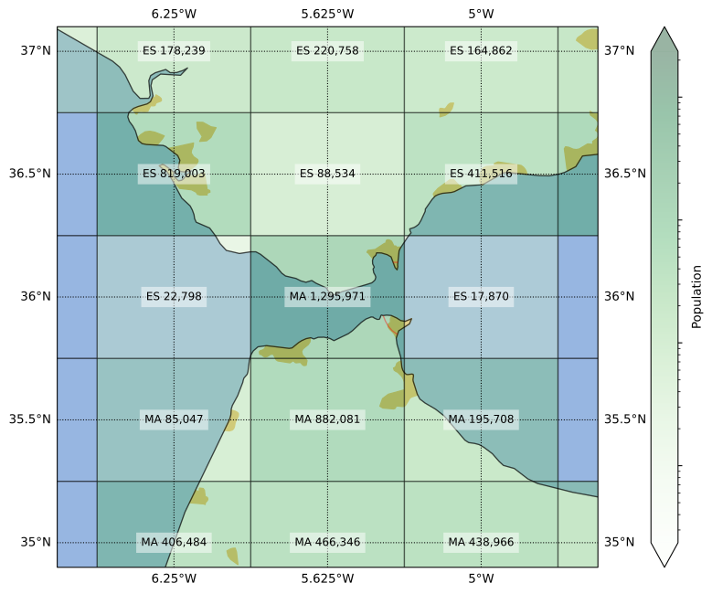
About half the central grid cell above is on water, but the two bits of land across the strait have a peculiar setup. On one side there is the only part of the UK in continental Europe; which, I just learned, voted 96%-to-4% to remain in the EU. On the other side is a part of the transport infrastructure supporting key elements of the supply chain of the Dutch pharmacological industry. I mean, it’s one of the bits of Spain in Africa.
What made me double-check this cell was that it was originally assigned to Spain (nobody expected it). If you recognize that yellow blob of urbanized area in the southwestern corner as Tangier, that assignment might sound wrong. Indeed, although most of the cell’s area is in Spain, most of the population is in Morocco, so I made the adjustment. The territory of Gibraltar itself, with a population not much larger than 30 k, does not have its “GI” country code show up in the gridded dataset.
All else being equal, I would have given preference to a country code that doesn’t appear elsewhere, as the extra diversity might increase the robustness of the overall calculations (i.e. outliers would at least have some impact on the results). But sometimes, a single grid cell is the only place where multiple country codes occur. Fourth stop, the Leeward Islands:

More specifically, the island of Saint Martin. This is where 100% of the border between France and the Netherlands lies—until they put up a wall between Wallonia and Flanders, that is.
Although a bit smaller, the more funnily-spelled Sint Maarten has more people than the Frenchly-pronounced Saint Martin, which is therefore not represented in the final dataset. It is interesting that five neighboring cells in this region have five different country codes, a sign that our grid struggles to resolve the complexity of the Caribbean political landscape.
But the French get their revenge elsewhere. Fifth stop, la Côte d’Azur:
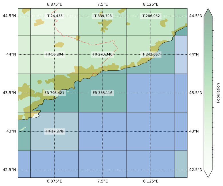
Monaco is almost entirely in this one grid cell whose main ingredient is Mediterranean water. Still, most of its land area is in France. Even though the center of Nice falls outside of this cell, the total population of Monaco is only around a tenth of the cell’s pop count. Because of that, I could rest easy that the “MC” omission was correct.
Speaking of water, people like it so much that the two flavors of city that exist are river city and coast city. This concentration of population in coastal areas is why I had to have all this work to make sure there weren’t significant mistakes in the dataset.
The sixth stop also illustrates the effects of rivers and coasts, Grand-Popo:
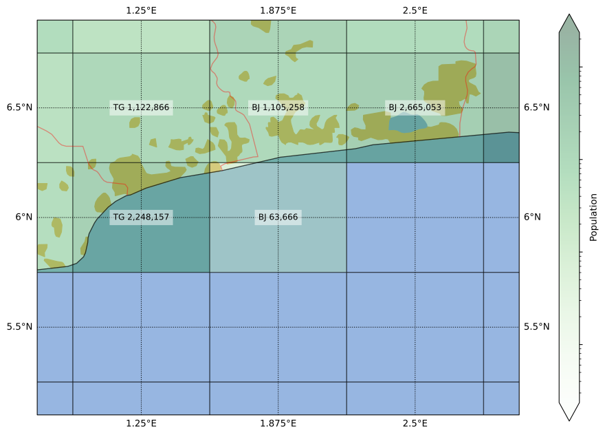
At first glance, the country borders seem to suggest that Benin is the Croatia of West Africa, taking up what you’d expect to be Togo’s coastline. According to a trustworthy and reliable source (some youtuber), there is an apocryphal story that a leader in Benin pushed for this border during the independence negotiations because he had a girlfriend there. Isn’t that beautifully romantic? Okay, maybe not so much if it was actually a mistress.
However, a closer look suggests a simpler explanation. The border follows the course of a river. They still could have drawn the border through main path of the river, which is a bit to the east, but it’s not like the current border is completely arbitrary:

By the way, although it’s the Togolese side that has an urban patch in the map, I reckon that the Beninese population is larger on the grid cell; but I could be wrong.
Border confusion doesn’t need coastlines though. Seventh stop, Central Asia:
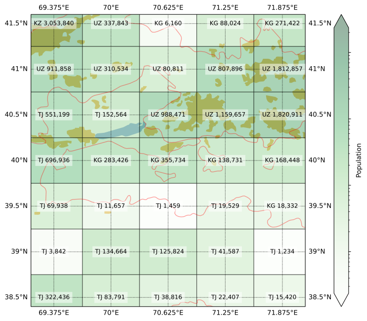
More specifically, the region of Transoxiana and the Fergana Valley. As the image shows, quite a lot of people live in this beautiful fertile land. This is also the center of the blender that spirals the three -Stans into a messy mix. Okay, I guess water access is at least a part of the issues there.
My mapping was meant to represent the year 2019, but I am glad to report that after the latest border clashes (2021, 2022), things have taken a diplomatic turn. Treaties were signed, cute BFF photos were taken, and details (like swapping land and the citizenship of thousands of people) are still being sorted out. Anyways, the verdict from the map above: the cell with Vorukh is mostly Tajik, while the one with Sokh is mostly Kyrgyz.
Maybe what is missing in Central Asia is a little interstitial country to stabilize tensions and keep borders from being violated. Eighth stop, Luxembourg:
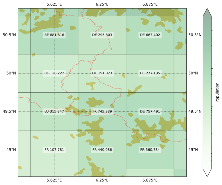
This is a fun one because although Luxembourg is spread over four cells, it managed to eke out a majority in one of them (at least according to my eye balling), but it is not the cell you would expect. The result is a 2×2 sub-grid with four different codes, a symbol of the Union of these European countries.
But not every border is between friendly countries. Ninth stop Southeast Alaska:
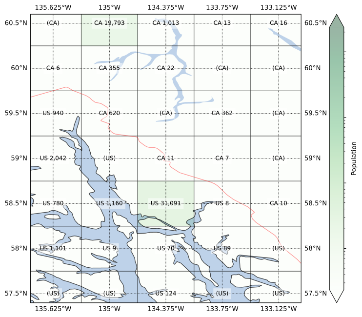
I think this is one the worlds most beautiful places: the water, the forests, the mountains, the wildlife, the snow. It must be an absolutely magical place—at least when the cruise ships are out of reach of your eyes, ears, and nose. As the map shows, not a lot of people live in this region, other than in the capitals Juneau and Whitehorse. One thing might be related to the other.
Despite the low population numbers, this border used to be contentious more than a century ago. Much more recently, there was even a “war” there, albeit “pacific” was part of its name. Although as recently as last week (at the time of writing), a new possible solution to the border issues was diplomatically proposed by a prominent leader involved. In the meanwhile, it wasn’t too hard for me to fill in the missing codes for my grid.
And finally, after so many conflicts and disputes, I figured we should end our tour on a more chill and peaceful note. Last stop, the Southern Levant:

Yeah… It’s hard to come up with anything to say here that doesn’t sound flippant, so I will refrain from doing so.
Conclusions
This exercise was a fun excuse to read up on some interesting places from all over the world. I don’t think there’s a lesson to be learned here other than maps are cool.
Leave a Reply