Tag: (Geo)politics

  • Country codes

    Country codes

    Long winding intro

    Imagine someone has a computer model of the Earth and its atmosphere. The atmosphere may be represented by a 3-d grid. If we ignore the vertical coordinate, you may have a regular latitude × longitude grid.

    Let’s then say you use a related computer model to investigate the effects some emissions have on the atmosphere. And then use those results to estimate the associated impacts this pollution has on human health. You would do so using epidemiological data, which are heavily dependent on healthcare and socioeconomic conditions (among many other factors), and that are produced and compiled at national levels. Can you imagine such a study?

    What you would have, in this theoretical scenario, is a need to figure out what country each of your politically ignorant grid cells is in. It seems trivial, but the thing about political borders is that there is always some trouble with edge cases.

    In this post I will go over some interesting things I found along the way of making such an assignment of countries to grid cells. There is no “one nice plot”, but rather a collection of small maps that will guide us on a world tour of a selection of country borders.

    Where am I?

    More precisely, how do you find out the name of a place given its geographical coordinates? Well, there is a fancy name for that: reverse geocoding. To give an analogy that is understood by only a vanishingly small number of people: it’s like looking up a number on the phonebook instead of looking up a name.

    I had a regular grid of the globe with a cell every 0.5° in latitude and 0.625° in longitude. At a latitude of around 36° this is equivalent to 56 km by 56 km, if I did the math right. My solution was to reverse geocode the coordinates of the center of each of the 361×576208 k361\times{}576\approx{}208\ \mathrm{k} cells (the polar cells are half-sized in latitude, hence the 361). To be honest, I actually ignored the North Pole and everything south of New Zealand, but you get the point. I did so using OpenStreetMap through the Nominatim API. For each grid cell, I saved the two-letter code of the country in the address returned by the API.

    Yes, country borders don’t quite align with the grid, but I thought that would be good enough. And it kind of was, except for two problems…

    The first issue is that a very large number of cells are in remote areas of countries where the reverse geocoding doesn’t return anything. Regions like Siberia, the Amazon, the Sahara, the Outback, and the Arctic Archipelago.

    The second issue is that in coastal regions, where a lot of people live, there is around 50% chance that the grid cell center will lay on the water. Sometimes Nominatim would give an (inland) address anyways, but more often than not it wouldn’t give a result.

    In hindsight, I should have instead used a dataset of country boundary lines, which should solve the first issue, almost all of the second issue, and be more agnostic to resolution (208 thousand lookups is quite of a lot). I would then check the area of the intersection between each cell and the country borders, or at least check whether the cell is inside a border. However, even with this solution I would still have to deal with the issue of cells containing a border between countries.

    Back to what I actually did, my goal was to assign a country to every populated grid cell. You can’t have human health impacts if there are no humans (taps side of head); environmentalists love this one simple trick. So I could just ignore the oceans and other big bodies of water. But because I thought of maybe using these data for other purposes (such as categorizing aircraft emissions by their location), I wanted to fill in the interior unpopulated gaps within countries.

    To do this task, I exported the country code data to a CSV file and opened it in Excel. Zooming out revealed a perfectly projected plate carrée world map. This made it easy to manually bucket-fill the large inland gaps.

    Resolving the issue of missing data for all populated grid cells, however, would prove to be a bit more laborious. The biggest problem is when one of those lies along the border of multiple countries. My simplistic methodology assigns a single country to each cell, which means I would have to make some choices in those cases.

    Population counts

    Because of reasons, I was using the LandScan 2019 global population dataset. It contains the population count on a much finer resolution of ~1 km, which I then aggregated into my coarser grid.

    It would be easier to assign each grid cell to the country with the most area inside of it. But the more correct approach here would be to give the cell to the country with the largest population within it.

    A first plot

    This is where today’s plots come in. I wanted to quickly check some edge cases, figure out why the reverse geocoding didn’t return anything, or decide what makes the most sense when a cell lies on the borders between multiple countries.

    I made short function using Cartopy that takes the coordinates of the center and some lat/lon margins. The output is a little map with several features: coastlines, country borders, large water bodies, and urbanized areas. The population count for each grid cell and the already assigned country code are printed in front of a semi-transparent white box. Each cell is also (semi-transparently) shaded based on its population.

    Here is the first example, Königsberg Калининград:
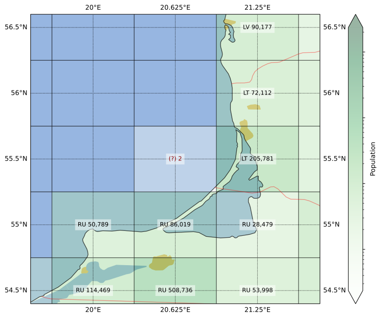
    For this figure I left the “problem cell” with no country code, to give an idea of what the assigning process looked like. The remaining plots already show the country codes that were ultimately assigned.

    You can see in this first plot that the grid cell center was in the water, but the cell also contains land from two countries. Lithuania was only ever so slightly clipped, so I assigned the cell to Russia. The impact of this was completely insignificant however, as the total population count here was 2 (two).

    Going on a world tour

    But of course, we I can always do even less useful work. To start off our world tour, the Persian Gulf:
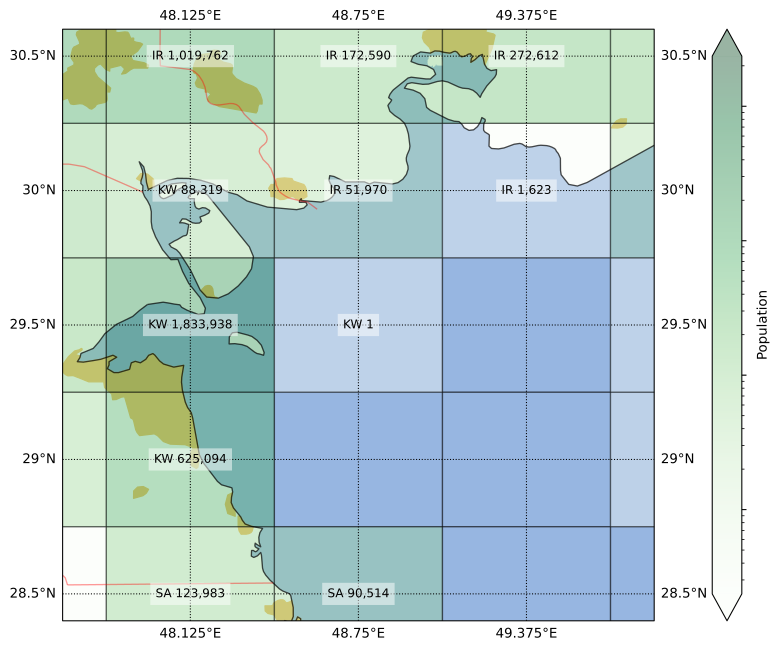
    The image actually undersells the situation, as the population counts are rounded up to the nearest integer. The grid cell edges of the native resolution Landscan dataset don’t perfectly align with those on the target grid I’m using, such that sometimes the population in the finer cell is split half-and-half between two coarser grid cells. In the case of the cell at the center of the figure above, the aggregated population totaled ½ person.

    Although this area looks completely on water, further inspection shows that it contains some islands too small to show up in the coastlines dataset. From what I can tell, this half-person populates the island of Auhah (Ouha? عوهة؟), owned by Kuwait. Youtube provides a couple of views of what’s like in this far-away* piece of land (*depending on where you are when reading this).

    The Landscan population data is produced in part by processing satellite pictures. Despite having no permanent residents (I guess), this small island has a few small shacks, and a convenient heliport. Hence, this is what the pop data looks like:

    I’m setting up a tracker to wait for something here to become available on Funda. Source: LandScan 2019.

    But sometimes, the island in question has hundreds of thousands more people than that. And it doesn’t always belong to the country with the nearest shores. Our second stop, the island of Bioko, illustrates this:
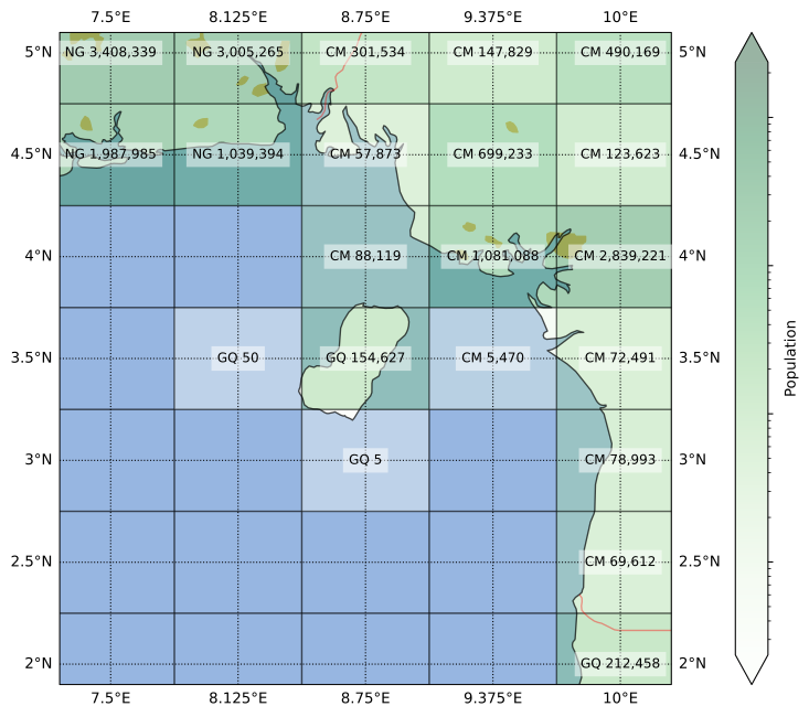
    Despite being much closer to Cameroon, Bioko is part of Equatorial Guinea. In fact, until a few months ago, that’s where country’s capital was located, in the city of Malabo. It’s a unique place with a quite interesting history, one that my South-American-educated self was unaware of before this tour.

    For example, Equatorial Guinea has the distinction of being the only African country where Spanish is an official language (if you ignore Western Sahara). Although some people in Bioko speak an English-based creole called Pichinglis, due to the complicated history of, hmm, intercontinental migration around the 18th and 19th centuries.

    Speaking of intercontinental, our third stop is the strait of Gibraltar:
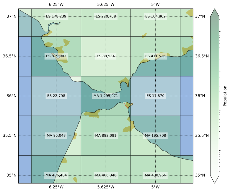
    About half the central grid cell above is on water, but the two bits of land across the strait have a peculiar setup. On one side there is the only part of the UK in continental Europe; which, I just learned, voted 96%-to-4% to remain in the EU. On the other side is a part of the transport infrastructure supporting key elements of the supply chain of the Dutch pharmacological industry. I mean, it’s one of the bits of Spain in Africa.

    What made me double-check this cell was that it was originally assigned to Spain (nobody expected it). If you recognize that yellow blob of urbanized area in the southwestern corner as Tangier, that assignment might sound wrong. Indeed, although most of the cell’s area is in Spain, most of the population is in Morocco, so I made the adjustment. The territory of Gibraltar itself, with a population not much larger than 30 k, does not have its “GI” country code show up in the gridded dataset.

    All else being equal, I would have given preference to a country code that doesn’t appear elsewhere, as the extra diversity might increase the robustness of the overall calculations (i.e. outliers would at least have some impact on the results). But sometimes, a single grid cell is the only place where multiple country codes occur. Fourth stop, the Leeward Islands:

    More specifically, the island of Saint Martin. This is where 100% of the border between France and the Netherlands lies—until they put up a wall between Wallonia and Flanders, that is.

    Although a bit smaller, the more funnily-spelled Sint Maarten has more people than the Frenchly-pronounced Saint Martin, which is therefore not represented in the final dataset. It is interesting that five neighboring cells in this region have five different country codes, a sign that our grid struggles to resolve the complexity of the Caribbean political landscape.

    But the French get their revenge elsewhere. Fifth stop, la Côte d’Azur:
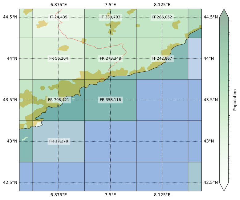
    Monaco is almost entirely in this one grid cell whose main ingredient is Mediterranean water. Still, most of its land area is in France. Even though the center of Nice falls outside of this cell, the total population of Monaco is only around a tenth of the cell’s pop count. Because of that, I could rest easy that the “MC” omission was correct.

    Speaking of water, people like it so much that the two flavors of city that exist are river city and coast city. This concentration of population in coastal areas is why I had to have all this work to make sure there weren’t significant mistakes in the dataset.

    The sixth stop also illustrates the effects of rivers and coasts, Grand-Popo:
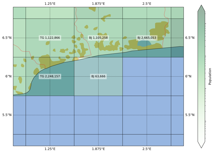
    At first glance, the country borders seem to suggest that Benin is the Croatia of West Africa, taking up what you’d expect to be Togo’s coastline. According to a trustworthy and reliable source (some youtuber), there is an apocryphal story that a leader in Benin pushed for this border during the independence negotiations because he had a girlfriend there. Isn’t that beautifully romantic? Okay, maybe not so much if it was actually a mistress.

    However, a closer look suggests a simpler explanation. The border follows the course of a river. They still could have drawn the border through main path of the river, which is a bit to the east, but it’s not like the current border is completely arbitrary:

    By the way, although it’s the Togolese side that has an urban patch in the map, I reckon that the Beninese population is larger on the grid cell; but I could be wrong.

    Border confusion doesn’t need coastlines though. Seventh stop, Central Asia:
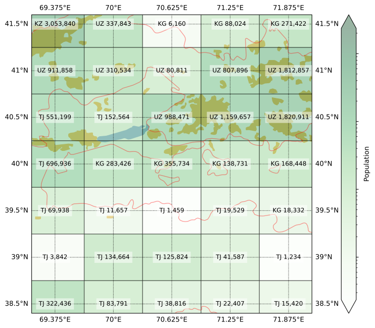
    More specifically, the region of Transoxiana and the Fergana Valley. As the image shows, quite a lot of people live in this beautiful fertile land. This is also the center of the blender that spirals the three -Stans into a messy mix. Okay, I guess water access is at least a part of the issues there.

    My mapping was meant to represent the year 2019, but I am glad to report that after the latest border clashes (2021, 2022), things have taken a diplomatic turn. Treaties were signed, cute BFF photos were taken, and details (like swapping land and the citizenship of thousands of people) are still being sorted out. Anyways, the verdict from the map above: the cell with Vorukh is mostly Tajik, while the one with Sokh is mostly Kyrgyz.

    Maybe what is missing in Central Asia is a little interstitial country to stabilize tensions and keep borders from being violated. Eighth stop, Luxembourg:
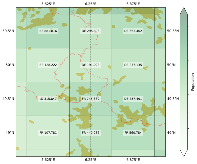
    This is a fun one because although Luxembourg is spread over four cells, it managed to eke out a majority in one of them (at least according to my eye balling), but it is not the cell you would expect. The result is a 2×2 sub-grid with four different codes, a symbol of the Union of these European countries.

    But not every border is between friendly countries. Ninth stop Southeast Alaska:
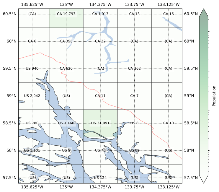
    I think this is one the worlds most beautiful places: the water, the forests, the mountains, the wildlife, the snow. It must be an absolutely magical place—at least when the cruise ships are out of reach of your eyes, ears, and nose. As the map shows, not a lot of people live in this region, other than in the capitals Juneau and Whitehorse. One thing might be related to the other.

    Despite the low population numbers, this border used to be contentious more than a century ago. Much more recently, there was even a “war” there, albeit “pacific” was part of its name. Although as recently as last week (at the time of writing), a new possible solution to the border issues was diplomatically proposed by a prominent leader involved. In the meanwhile, it wasn’t too hard for me to fill in the missing codes for my grid.

    And finally, after so many conflicts and disputes, I figured we should end our tour on a more chill and peaceful note. Last stop, the Southern Levant:

    Yeah… It’s hard to come up with anything to say here that doesn’t sound flippant, so I will refrain from doing so.

    Conclusions

    This exercise was a fun excuse to read up on some interesting places from all over the world. I don’t think there’s a lesson to be learned here other than maps are cool.
  • Overstay in the U-Ess-A

    Overstay in the U-Ess-A

    Long winding intro

    As an immigrant married to a twice-immigrant, I can’t help but glance at the torrent of ugly immigration related news coming out of the country with the most immigrants in the world (see these fancy plots for the answer). I find it to be a good distraction from all the anti-immigration stuff happening here, where I’ve migrated to.

    Fans of the 2017 classic Trump Travel Ban®: Muslim ban? rejoiced when a sequel was released June 2025, dubbed the Second Trump Travel Ban®: Restricting the Entry of Foreign Nationals to Protect the United States from Foreign Terrorists and Other National Security and Public Safety Threats. With a presidential proclamation, the United States imposed a “full” travel ban on 12 countries and a “partial” travel ban on 7 others.

    What this meant in practice was the prospective ban on visas being issued to persons foreigners from the targeted countries. “Full” here means a ban on all immigrant and non-immigrant visas. “Partial” means all immigrant plus some major types of non-immigrant visas: B-1/B-2 (business visitor / tourist), F/M (international students), and J (exchange visitor). In both cases, exceptions apply in a number of circumstances, such as for permanent residents, immediate relatives of U.S. citizens, participants of the upcoming FIFA World Cup and Olympic Games, etc. Don’t you love how the Olympics bring people together?

    As the American Immigration Council points out in the article linked in the last paragraph, the justification for this was mainly based on three factors. First, the country’s screening and vetting of applicants and information-sharing with the U.S. Second, the likelihood of visa overstay and how easy it is to hand-wave a whole country and say “terrorist”. Third, how cooperative the country is in taking back deportees.

    This ban was then expanded on December 2025. As of the start of 2026, nationals of 20 countries are now “fully banned” (including people with a Palestinian Authority travel document), while those of another 20 enjoy a partial ban. This expansion was the expected next step after the government continued its review on the subject, using the same stated rationale.

    As this policy memorandum from January 1, 2026 by the U.S. Citizenship and Immigration Services demonstrates, the effect of these proclamations goes beyond stopping the issuing of new visas. Aliens from High-Risk Countries who entered the U.S. on or after January 20, 2021 will have their immigration benefits undergo a comprehensive re-review, requiring a potential interview and re-interview. Also, note that the restrictions are being applied to “aliens with a nationality, country of birth, or aliens who have acquired Citizenship by Investment (CBI) listed in PP 10998”. So just being born in a “high-risk” country is getting you banned, even if you don’t hold that nationality.

    Anyways, I am not qualified to do that Family Guy meme to determine how terrorist-harboring each nationality is. So instead, I wanted to look into how U.S. visa overstay rates compare for nationals of various countries. Can these rates really explain the selection of countries for the ban?

    An important disclaimer is that I am not looking at the actual merits of these decisions, whether any of this makes sense, or if these developments are good or bad. If you need to be told how to feel about these policies, you should first try soul searching in the lost and found, because you are likely missing something a random blog could not possibly provide. I just wanted to look at some data here, devoid of any deep political discussions.

    Keeping up with the news

    Things are moving very fast, and between me making the plot and writing this article, a big new restriction was enacted. On January 14, 2026, the U.S. Department of State decided to pause all issuances to immigrant visa applicants who are nationals of 75 countries, effective January 21, 2026. This was done so they could do a “full review of all screening and vetting policies to ensure that immigrants from high-risk countries do not unlawfully utilize welfare in the United States or become a public charge”.

    Some of the 39 countries already banned are also included here, plus a fresh new 52. Presumably, divergences in the selections are due to this new restriction being justified more specifically on countries not being trustworthy enough on their own processes and not cooperating enough with the U.S. in sussing out the undesirables. As of February 16, 2026, this pause is still in effect, with no estimate of an end date.

    There are cynics who are saying certain religions or ethnicities are being deliberately target with this restriction. Or that personal friendliness or animosity between U.S. and foreign leaders somehow play a role in these decisions. But as I said, these discussions are outside of the scope here. I did redo the plots however, adding a little extra indicator on whether a country is subjected to these newer restrictions or not.

    Data

    The Department of Homeland Security’s (DHS) Entry/Exit Overstay Report, referenced in the banning proclamations, presents the official fiscal-yearly estimates of how often holders of a non-immigrant visa overstay in the U.S. More precisely, this is how the latest report self-identifies:

    This report provides data on expected departures and overstays, by country, for foreign travelers to the United States who were admitted as nonimmigrants at an air or seaport port of entry and were expected to depart in Fiscal Year 2024 (October 1, 2023 – September 30, 2024).

    This report is the main evidence cited by that December 2025 proclamation to support the travel bans. So it’s worthwhile to make some notes before going to the figures.

    Firstly, technicalities. What is and isn’t in the scope? This is how the report defines “overstay”:

    An overstay is defined as a nonimmigrant who was lawfully admitted to the United States but remained in the United States beyond the authorized period of admission. (…) U.S. Customs and Border Protection identifies two types of overstays: 1) individuals for whom no departure was recorded (Suspected In-Country Overstays), and 2) individuals whose departure was recorded after their authorized period of admission expired (Out-of-Country Overstays).

    Canada and Mexico are treated differently in the report, as a lot of people from those countries cross into the U.S. somewhere not an “air or seaport port of entry”. Only non-immigrant (which I’m sticking to hyphenate) visas are concerned. Some non-immigrant visas are also out-of-scope: “crewmembers, travelers in transit, and special protected classes under Section 1367”.

    Secondly, one should keep in mind that the data come from the United States Customs and Border Protection (CBP) agency of the DHS. So, absent of any ways of independently checking the data, the federal government machine is kind of self-certifying the justifications for its own policies. Which is to say the numbers are only as significant as the credibility of the organization producing them.

    Personally, I don’t see any reason why not to trust these specific reports at this point. But it might be worth to understand how the overstay numbers are produced, as they are perhaps overestimates. That American Immigration Council article refers to this piece from 2020, which in turn quotes from a report from a different think tank calling out “flaws” in the CBP/DHS visa overstay reports. The main issue raised is that overstay counts consist of all cases in which a departure could not be verified.

    This would also include persons whose visa has expired but are having an application for a different “right to stay” being processed, such as an extension of their visa or a request for asylum. As the Executive Summary of the DHS report puts it:

    Determining lawful status requires more than matching entry and exit data. For example, a person may receive a 6-month period of admission upon entry and then subsequently apply for and receive an extension for the period of admission of up to 6 months from U.S. Citizenship and Immigration Services. Identifying extensions, changes, or adjustments of status are necessary steps to determine whether a person has overstayed their authorized period of admission; this report was generated with improvements to data analysis in an automated fashion to better account for these changes.

    In total, nearly 46.7 million “in-scope” air or seaport arrivals were expected to depart in FY24. From that, 539 thousand (1.15%) overstays were counted at the end of FY24 (October 1, 2024). Out of those, 483 thousand were suspected in-country overstays (1.04% of total). By February 6, 2025, that number had reduced to 427 thousand (0.92%) due to newly confirmed departures or changes in status.

    Visa ABCs

    Before getting into the plots, there is a final bit of background information needed. Visas as permissions to enter a country for a specific set of reasons. These can be broadly split into “immigration” and “non-immigration”, depending if the person is moving into the country or just visiting temporarily. As mentioned before, although the bans are (also) completely halting immigration from the affected countries, the overstay report only concerns non-immigration visas.

    Within this category of “non-immigration”, there are still several classes of visas. In fact, the overstay report lists 48 different classes within its scope and 27 outside it. The report breaks down overstay counts into three parts, which I am labeling as “B”, “FMJ”, and “Other”:

    • B: business or pleasure, consisting of B-1 (business), B-2 (tourism), Waiver-Business, and Waiver-Tourist classes.
    • FMJ: students and exchange visitors, consisting of F1/F2 (academic students / their spouse and children), M1/M2 (vocational students / their spouses and children), J1/J2 (exchange visitors / their spouses and children).
    • Other: every other in-scope non-immigration visa, including temporary workers and trainees, intracompany transferees, treaty traders and investors, alien fiancées of U.S. citizens and children, Legal Immigration Family Equity LIFE Act, attendants / servants / personal employees of diplomats and other representatives.

    The U.S. has a Visa Waiver Program that basically gives the equivalent of a B1/B2 visa access to citizens of certain countries without them having to get a visa first. That’s what they mean when they say, for example, a Dutch person can visit the U.S. without a visa. In practice, you still need an “Electronic System for Travel Authorization (ESTA)”, and not everyone qualifies for this benefit (including if you visited certain countries without the purpose of bombing them). Terms and conditions apply, including a 90-day limit on visits like a B-class visa, so the numbers are presented alongside our “B” category.

    For simplicity, because the proclaimed travel bans mention only the “B” and “FMJ” rates as justification, I ignored the “Other” category and looked only at the former two. Remember that these (B, F, M, J) are also the classes of visa being banned under the partial ban.

    For the plot, I grouped countries of citizenship into “Full ban”, “Partial ban”, “No ban”, and “Visa waiver”. Separately from the Visa Waiver Program, Canadians can enter the U.S. under most circumstances (and for longer than 90 days). Likewise, citizens from the pseudo-colonies states freely associated with the U.S. have full freedom of movement (terms and conditions apply), i.e. the Marshall Islands, the Federated States of Micronesia, and Palau. For simplicity, I lumped all those four into “Visa waiver”.

    Visas scattered in the wind (it’s just a scatter plot)

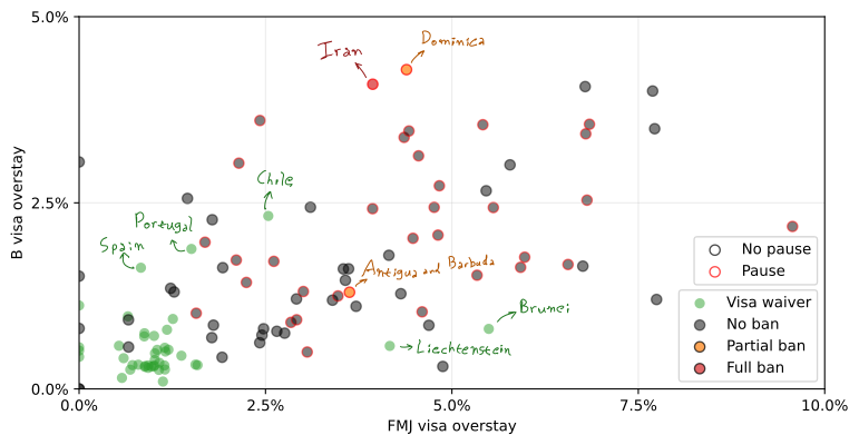
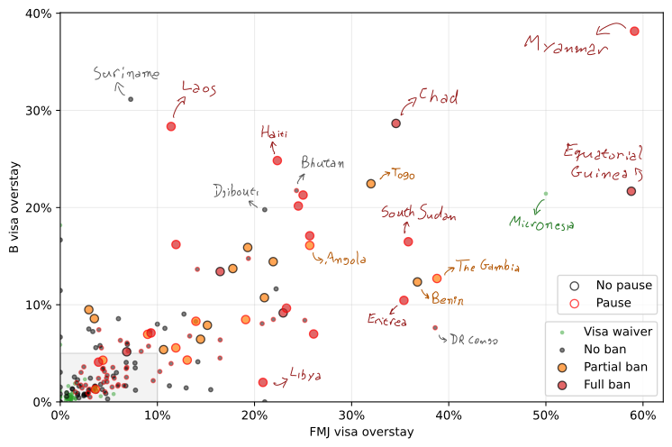
    What I did was just take the overstay rates in the FY24 report and make a scatter plot with the “B” rate in the y-axis, and the “FMJ” rate in the x-axis. This choice was based solely on the fact that the latter are usually higher, I wanted the same scale on the axes, and I prefer a wider rather than taller plot (I’m a millennial who views things on a 16:9 monitor).

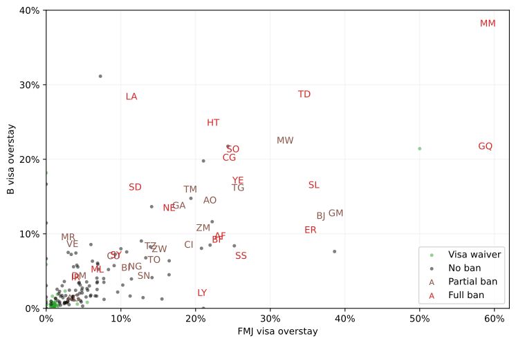
    The main dataviz challenge was on how to indicate what country each point represented. There were 194 nationalities listed after all. An intermediate solution was to replace markers with the two-letter ISO code for the banned countries:

    But most people are not going to immediately recognize the codes for these countries. I admit it’s not often I visit a .td, .gm or .bj website. Also, I realized you have to be careful when using letters as markers so that you don’t accidentally form offensive words. Niger to the left of Gabon was enough of a close call.

    So the final solution was to add annotations to the countries with the highest rates. Because sorting out the layout of this would quickly become too much work if I manually added coordinates for each annotation, I chose instead to do it manually. And by “manually” I mean use my actual hand with a digital pen to write the annotations. Since I’m not used to use a digital pen like this, my setup was probably not ideal, and it took a while to get a passable handwriting.

    Anyways, here’s the final figure:

    The “Pause” / “No pause” indicators relate to the pause in granting immigration visas started on January 21, 2026. Since its not directly related to the non-immigration visa overstay rates, and they were final additions to the figures (after I had selected the points to annotate), I won’t discuss them further.

    So, generally speaking, yes, banned countries tend to have high visa overstay rates. You still have banned nationalities with lower rates than non-banned ones. This could be partially explained by FY23 rates, which can differ a bit from the FY24 values plotted, being used as justifications in the first proclamation from June 2025.

    Another reason is that, as described earlier, overstay rates were only one of three “issues” used as justification. This is clearer when looking at the other extreme of the plot, i.e. the countries with the lowest overstay rates:

    The U.S. has long added a big red label of “terrorist” on Iran’s figurative forehead, so no surprise on that red dot. Dominica and Antigua and Barbuda, on the other hand, are being banned due to having “historically had CBI without residency”. CBI meaning citizenship by investment.

    Another obvious anomaly seems to be Micronesia, the only green dot far out on the plot. No Micronesian needs a U.S. visa under regular circumstances, there is a requirement only if you acquired citizenship by investment or if are naturalized and have not resided there for 5 years yet. The full freedom of movement enjoyed by the members of the Freely Associated States means there should only be an expected departure in these rare exceptions. So the “B” rate is 6 unverified departures out of 28 expected, and the “FMJ” rate is 1 potential overstay from just 2 expected departures. If you look closely at the y-axis of the first figure, you can see also Palau (2/11 and 0/4 for “B” and “FMJ”, respectively) and the Marshall Islands (3/51 B, 0/4 FMJ).

    This is an argument raised in the criticism by the American Immigration Council, that the overstay rates “often are based on very small overall numbers of people. For example, the nation of Chad, with a population of over 19 million people, had just 377 suspected B-1/B-2 tourist visa overstays in 2023.” Although I can imagine the counter argument being that “well in that case the ban impacts few people anyway”.

    In conclusion, I guess I made a couple of plots with colorful points and text on them. Not sure if that makes up for the feeling of the tightening grip of nationalism and isolationism all around us, while I live in a house with multiple passports, none of which of the country we reside in. People from high-risk countries seem to overstay their visits to low-risk (?) countries, but I’m not sure if we got cause and effect order right between high-risk and high overstay rate.

    Also, hi to the immigration officer reading this when deciding whether or not I can visit Disneyland. Who am I kidding, it’ll probably be an AI scraping bot that will ingest this and spit out a Songbun rating with a confidence score.

  • U.S. Civics Test

    U.S. Civics Test

    Long winding intro

    Unlock life in America

    It has never been as appealing to be an American as it is today. I thought of making every word of the previous sentence a different hyperlink that illustrates this, but at this point you don’t need me to prove you this fact. However, being an American is not a right, it’s a privilege. A privilege that is, of course, the ultimate ambition of every single non-American in the world. Either you are an American, or an alien who dreams of being allowed to dream the American Dream.

    God has only bestowed a select few with the blessing of being a red-white-ang-blue-blooded natural American, emphasis on the white. But because the Land of the Free is also a land of opportunity, if you are a non-citizen who has an outstanding work ethic, share the same American Values, is law-abiding, is not a threat to national security, has filled out all the forms in a timely manner, and has paid all the applicable fees, you may also be afforded the benefit of being allowed to life in the U.S. Eventually, even, you may even achieve the highest honor envied by billions worldwide, and receive citizenship of the United States of America.

    But pump your brakes there kid, your decades-long journey gotta start somewhere. Referring back to the very start of the article, may I suggest the following:

    Don’t confuse this with a golden visa (derogatory), the Trump Gold Card is a “visa based upon an individual’s ability to provide a substantial benefit to the United States. (…) nonrefundable, $15,000 DHS processing fee. (…) A $1 million gift upon completion of the individual’s vetting is evidence that the individual will substantially benefit the United States. An individual may also need to pay small, additional fees to the U.S. Department of State depending on his or her circumstances.” Under the hood, what happens is the provision of such fees and gifts may expedite your application for an EB-1 or EB-2 visa. This is the visa for aliens with extraordinary ability. Legal terminology, by the way.

    Since I hold no such high ambitions for myself, I have to cope with my FOMO by just maintaining some curiosity on the whole thing; at a safe distance. And as I was reading up on migration news—on the only news source I will ever need—I came across a picture of the finish line I will never be lucky enough to see for myself: the Naturalization Civics Test. The news was that they were aligning it with Executive Order 14161 but, uninterestingly, the content of the test itself remained unchanged.

    Having some previous experience with the equivalent test from a different country, I was curious what it looked like, and what would my chances be of passing it. An USCIS officer orally (ew) asks you questions until it is mathematically clear you are either American (12 correct out of 20), or merely an alien who filed Form N-400 (got 9 wrong before the 20th question).

    The thing is though, these 20 Qs are sampled from a list of 128, which are published along with the exact answers you must give. So it is actually just a performative, ceremonial, memorization test, whose goal I guess is to enhance one’s Americaness to an appropriate level before giving them a passport.

    Am I civil enough to be an American?

    So, could I pass the exam? Yes, I still have good enough short-term memory. If I can memorize 151 Pokémon for nearly three decades and counting, I could memorize a hundred or so mostly one-word answers for a one-time exam. But I wouldn’t even have to, because the questions are quite easy, as you’ll see.

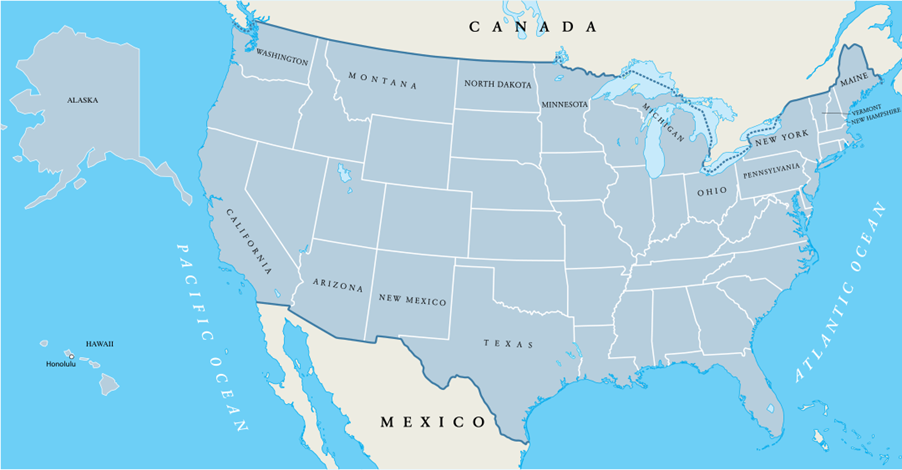
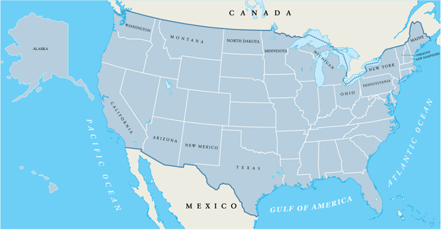
    By the way, while the content of the test is still basically the same, they did replace the useless accompanying textbook for applicants to study for the exam. I don’t know why you would go through the trouble of reading all of that instead of going straight to the list of Q&As, but the “A More Perfect Union: Guide to the Monuments and Memorials on the National Mall for the 2008 Civics Test” was a cute harmless way of teaching civics and American history. This had already been replaced (in 2024?) by “One Nation, One People: The USCIS Civics Test Textbook”. Now they did a very minor update to that. For example, see if you can guess which is the 2025 version:

    I have a theory that everyone thinks they are special. My country is not like other girls, and things of this nature. And because everyone thinks that, they aren’t; we’re all the same. Now, questioning American exceptionalism in these circumstances would surely disqualify you from naturalization and put you on an expedited path to learn about the Second Amendment. But when I took a look at the test questions, I couldn’t help but notice that some of them are not really unique or specific to the U.S. So this got me wondering, just how many questions of the exam could be answered correctly even if you knew absolutely nothing about the U.S?

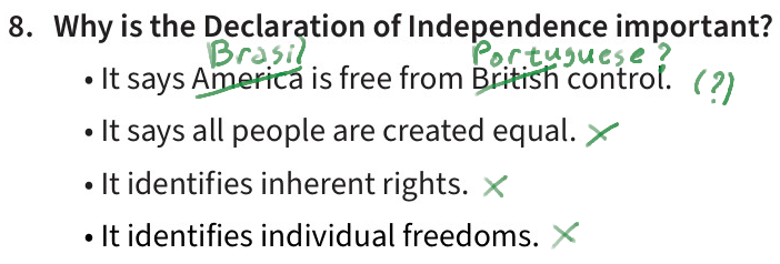
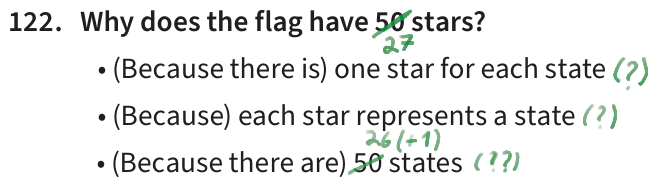
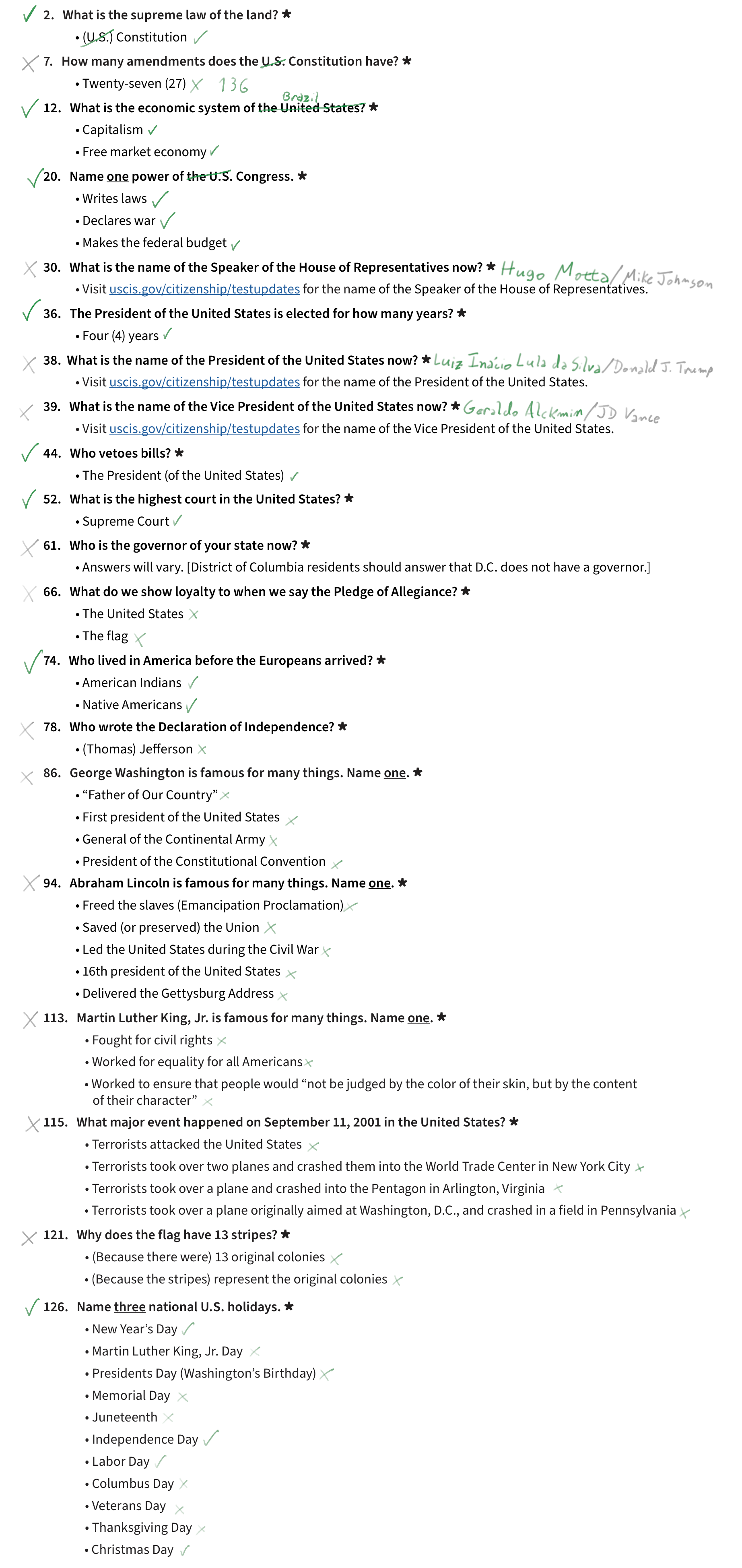
    I set about “taking the test”. Exactly how many questions of the 128 would I get right if I replaced “United States” with “Brazil” (and related wording), and answered accordingly? Then, what exactly would be the odds of passing the test for this unrealistically un-American applicant?

    The experiment was fascinating, as some answers matched because the countries are similar, and others matched kind of by coincidence. The exact result depends a bit on how flexible I am in the “translation”. For instance, there were two questions that I was unsure, so I gave myself half a point each:

    You could argue that the Declaration of Independence did not say Brazil was free from British control. And no, the Brazilian flag does not have 50 stars.

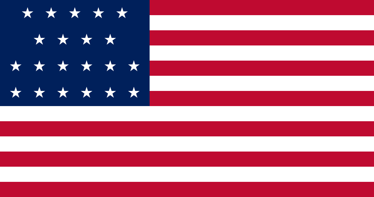
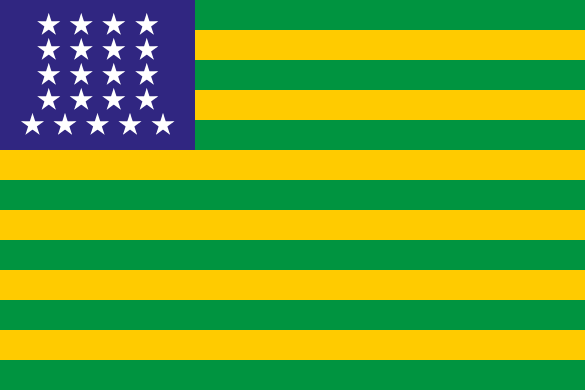
    Tallying up the scores, I counted 55 correct answers. This implies that I am, legally, 43% American. Which, given my parents, actually makes some sense. Another valid interpretation is that Brazil is 43% the same as the U.S., and that the flag below shall be henceforth flown from all staffs in Brasília. Since it used to be the flag of the United States in 1819, this also means Brazil is some 206 years behind. Which, likewise, fair enough.

    Fun fact, when Brazil became a republic in 1889, the first idea for a flag was to just copy the American one. Coincidentally, that flag also had 21 stars; the American one had 38 by that time. The following design was used for less than a week before they invented having shame, and a more original design was chosen

    But hold on a minute. An alien needs a score of 60% to pass the exam, so does this mean I’ve failed? Not quite. All is fair through the magic of probabilities. Dusting up some of that knowledge I didn’t pay to learn at college (or was this in high school?), I recall (Wikipedia recalled) that the chances of getting at least 12 passable questions would be:

    s=1220(55s)(1285520s)(12820)=s=1220s!(55s)!55!(20s)!(53s)!73!20!108!128!=7.7%\sum_{s=12}^{20} \frac{\binom{55}{s}\binom{128-55}{20-s}}{\binom{128}{20}} = \sum_{s=12}^{20} \frac{\frac{s!(55-s)!}{55!}\frac{(20-s)!(53-s)!}{73!}}{\frac{20!108!}{128!}} = 7.7\%

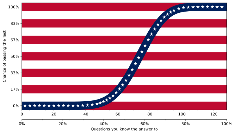
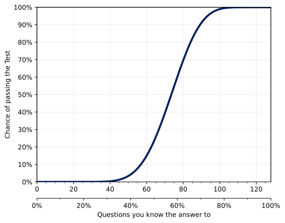
    So Brazil has a 1-in-(a lucky)-13 chance of a pass. Note that I assumed questions would be picked randomly. I would imagine they actually pick a few questions from each subject, but for the lack of better information, this will do for the analysis. Our plot for today is how the odds change if fewer or more questions match. You’ll find that below.

    1 in 13 is not great, not terrible. But since naturalization is a serious endeavor, you don’t want to leave it to chance. Therefore, we should psychologically and financially prepare ourselves to take the exam enough times to be confident in a positive outcome. Scientists like to use 95% for some reason, so let’s stick to that:

    1(10.077)n0.951-(1-0.077)^n\ge0.95

    Which gives… n38n\ge{}38. I don’t know how long it takes for the whole scheduling procedure and so on, but I’m sure it’s all very reasonable. Money-wise, the form to apply for naturalization generally costs $760, or just $710 for an online application. However, you may notice that, as of Q3-2025, the average monthly income in Brazil is R$3,528, which Google tells me is around 630 USD at the moment. This should comfortably put you below 400% of the Department of Health and Human Services Poverty Guideline, which in 2025 sits at an annual income of $62,600 for a 1-person household, meaning you can apply for 50% off discount on the N-400 fee. Hell, the Belastingdiesnt can confirm I still to this day qualify for this generous offer. All told, setting aside $14,440 should be good enough for our exam expenses.

    Person, woman, man, camera, TV: 65/20 rule

    Because the Test is actually a ceremonial affair that relies just on the sharpness of your memory, there is a small problem. Memory degrades, as the 15 minutes my SDD sometimes takes to boot up demonstrates. So there is a Special Consideration for applicants 65+ years old and who have been lawful permanent residents of the U.S. for 20+ years. In this case, you need just 6 correct answers to 10 questions from a reduced 20-question pool.

    This is short enough that I can copy here all the Brazilian answers to give you a taste of the exam. It also makes it reasonable for me to try to verify if the Netherlands would do any better in this regard.

    [SPOILER: 20 questions]

    Brazil does about the same in the shorter test: 8 out of 20 (40%). But for inexplicable reasons (math), the odds of passing the exam are a little bit better: 8.5%.

    The Netherlands does worse, getting only 4 answers correctly, making it impossible to pass. The differences are: Brazil has a president elected every 4 years, who vetoes bills; Native Americans lived there before Europeans; and we have national holidays for Independence Day and Labor Day.

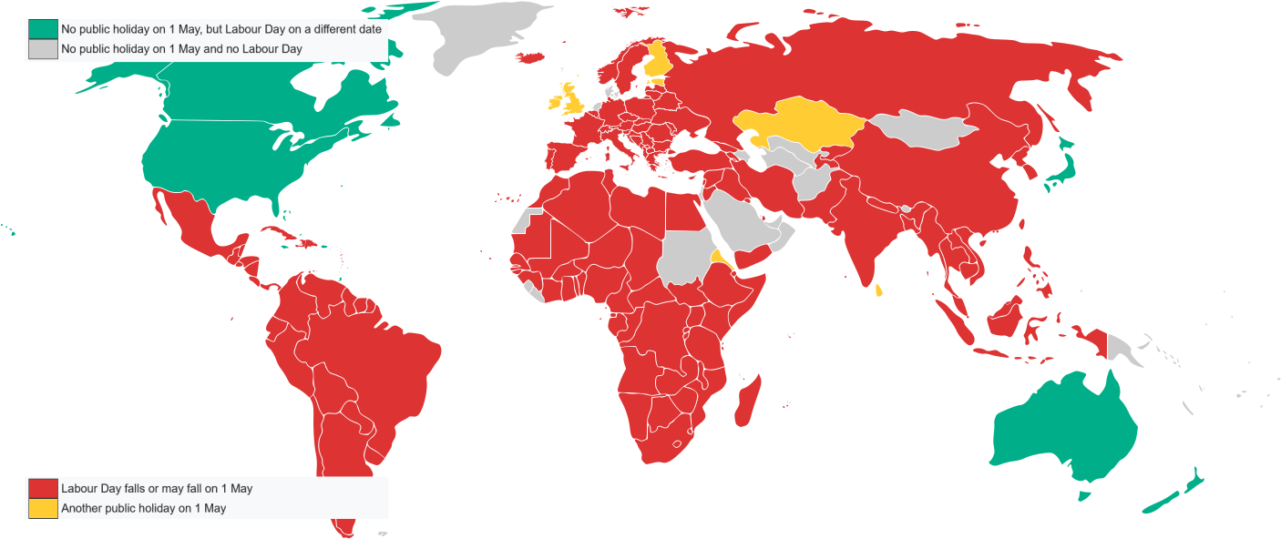
    That last one is about names of holidays, not dates. The day Brazilian Will Smith nukes a bunch of aliens (not those aliens!) is September 7. And the Dutch are very American in that they eschew May Day, because communism. In my house, Loyalty Day is the most important day of the year. But the Dutch do go overboard on capitalism, as we have no labor day at all here:

    Brazil is more American than the Netherlands, okay, but can we do better than that? We have to look in the Americas to get the Native Americans question right. Three of the twenty questions are about specific persons, so it’s impossible to get those. Only the U.S. has a national flag with 13 stripes. Maybe there is another declaration of independence written by a “Jefferson”, but it’s unlikely. No major event happened on 9/11, 2001 in other countries.

    There are two other American countries with a “pledge of allegiance” wiki page. But the Bahamas does not have a president. Mexico does, but the president has a 6-year term and might not be able to veto bills (?).

    Though unlikely, some other constitution might have 27 amendments, but I’m not going to check that. I think the best hope lies in having a name match. I am not sure how to evaluate the “who is the governor of your state”, because what would I compare it against? Finally, given current answers, I could not find any matches for President, Vice-President, or Speaker of the House. Even with the name “Johnson”. But this could change in the future. We will keep a close eye on this. For the time being, I’m afraid you cannot find a more Americanable country than Brazil.

    Plot

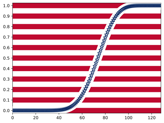
    I started with a simple plot to see how the odds of passing the test would change with the numbers of answers that matched. In trying to make it prettier, I thought it would be a nice touch to use the colors of the American flag. Which is when an idea came to me and I realized what was the true manifest destiny of the plot: to be in the format of the star-spangled banner.

    Because it ended up being quite style-over-function, I still put the finishing touches on a more conventionally formatted line plot, as a more readable version:

    Below is a bonus preliminary version, when I colored the gridlines red. It was at this moment I decided to go all-in on the flag theme. Comparing it to the other two versions shows my line of thought and how the stylistic choices came to be.

    Gridlines became the 13 stripes. That spacing is nice because it marks the odds in steps of 1:6, like the common die. After markers became stars, it was clear I should keep only 50 of them. You can notice that their horizontal spacing is not uniform, with a star every 3 questions in the edges and every 2 in the region around the line’s highest inclination (50% odds are between 73 and 74 questions). The aspect ratio also changed to approximately match the 1:1.9 of the flag.

    P.S.

    I wrote this in 2025. Maybe it was all a moot exercise, and all we have to do to become Americans is wait.