Long winding Intro
One of my least controversial opinions is that soccer is incredibly boring to watch, and that people who are passionate supporters of a club (or national team) tend to be incredibly annoying. That makes me an expert on the subject. And this being a FIFA World Cup™ (® 2026 Jared Kushner and co.) year and all, I figured I could make a plot or two about the Beautiful Game. It was actually the UEFA Champions League that inspired me for this post, but I couldn’t quite meet my target of finishing the article before this year’s champions league finals.
What caught my attention is that England seems to have quite a few teams that are doing well at the continental-level contests. Additionally, the (English) Premier League has a “Big Six” of top-tier teams, which should provide for a high-quality competitive national league (please ignore the fact that one of those teams has been on the verge of relegation for the past two years). Meanwhile, the national leagues of other European countries seem to be dominated by two or three clubs that are much richer and powerful than others. Because of this, they are derogatorily called “Farmers Leagues“.
But even looking just at the Premier League, I get the impression that things are much less competitive than what I remember from the national league in Brazil back when I was growing up in the 90s. Manchester City’s record-breaking 2017–18 season had them winning the championship with 34 wins, 4 draws, and just 2 losses, totaling 100 points. The following two seasons were won by Manchester City again with 98 points, then Liverpool with 99 points.
So here’s my idea: what if I used the Gini index to quantify this hoarding of points in a league by the top teams? Would that be a good indicator of inequality of performance, or the “farmness” of a league? And if so, could it reveal which national leagues are more competitive than others?
When I graduated I took a small oath that said I should be clear and honest in reporting my scientific results, such that society can rely on my judgement. So take this as a disclaimer to not take any of this article seriously. However, just to add a little faux-rigor to the proceedings, I am laying out some hypotheses before I get the results:
- Hypothesis #1: the Gini index is adequate in setting apart a more “one-sided” league from a more “evenly-competitive” one.
- Hypothesis #2: the Premier League has less inequality than the other top-level domestic leagues in the “Big Five” (Spain, Germany, Italy, and France).
- Hypothesis #3: the Brasileirão (Brazil’s top league) has less inequality than the top-level domestic leagues in the Big Five.
- Hypothesis #4: inequality in championship points is correlated with inequality in wealth between teams.
- Hypothesis #5: I can come up with a different metric that is a better indicator of a league’s farmness than the Gini index.
Sourcing the data
Very little data is needed for this exercise, only the overall championship table with the points earned by each team. Maybe it’s just me not being a sports guy, but Wikipedia is where I would go to look for this type of information. Thanks to whatever saint made a “League Table” template, the format is almost identical in the (English language) Wikipedia page of every national soccer championship.
Since it looks so easy, I figured I should download the results from every top-level league in the European soccer confederation. I don’t know where they get all these countries, but there’s apparently 55 UEFA members. All but Liechtenstein have their own domestic league. I mean, even the Faroe Islands have a complete system including a fourth tier league.
To get more robust conclusions and to capture changes in inequality over time, I wanted to get the last 12 years or so of seasons (three 4-year World Cup cycles). I don’t remember why, but I ended up extending that to results going back to 2013. For the championships scheduled over a calendar year, the range was from 2013 to 2025. For the championships that follow a (Northern-hemisphere-centric) school year format, the range was from 2012–13 to 2025–26.
To compare against these unequal Europeans, I also got the data for the leagues in Brazil and the United States, since I previously discovered that I am 43% American. After all, these are the two countries with the most World Cup titles (see here and here for more information; and no, West Germany is not a real thing). The combination of the aforementioned Big Five with Brazil and the US is henceforth referred to as The Seven, as that is the focus of the analysis. I later grabbed more data for The Seven going back to the year 2000.
After writing some scripts, sieving out the results with Beaultiful Soup, and manually fixing countless edge cases, I ended up with 858 seasons worth of data, totaling 12,210 rows. It’s never “too easy”…
Inequality in points earned is compared in the analysis against a few other variables, so there are some extra sources of data needed. “UEFA Association club coefficients” are taken from UEFA. Country income inequality is taken from the World Bank. And club and league market values are taken from Transfermarkt.
Game Gini
Introduction 2
The Gini coefficient, which I am calling index to be more space-efficient, is an indicator that quantifies income inequality. But although measuring income inequality (and sometimes wealth) was its original purpose, I don’t think anyone can stop me from applying it to some other variable, such as points in a competition. The Gini index is basically the ratio between the integral of the line of cumulative sum of income from the lowest to highest earner (or our alternative variable of interest) and the integral of the same cumulative curve but if income was equally distributed.
For our discrete case, I applied the following formula to each season of each league:
where is the amount of points team (out of teams) won in the championship. I only considered results in which the team was listed as having more than zero games played and at least zero points. Why do I even have to say that? Let’s explore the dataset a bit before the main results…
Stand-out performances
There were 39 instances of a team finishing the season without a loss, but only one case in which a team won every single game (i.e. no draws). The Lincoln Red Imps won all 10 games of the 2021–22 Gibraltar National League. However, although I only considered the first phase of the tournament with all 11 clubs, the top 6 then participated in a playoff called the “Championship Group”, and the Red Imps only won 9 of those 10 extra games, with Europa FC achieving a heroic 3-3 win against them. The wiki page of the Red Imps also says they hold the European record of 88 straight unbeaten games, achieved between 2009 and 2014. This GOAT team also has the highest season goal difference in my dataset: 121 GD (130 goals for, 9 against) in the 27-game 2015–16 season.
On the other hand, FC Florești finished the 2021–22 Moldovan National Division with zero wins, zero draws, 28 loses, and negative 6 points. They were excluded from competition after 19 games for match-fixing allegations, with their remaining 9 matches ordered to be considered “administrative loses”, and they received a 6-point deduction for this alleged match-fixing. But that’s peanuts. The lowest amount of points in the dataset was −29, achieved by Alki Larnaca in the 2013–14 Cypriot First Division after a 0-2-24 record:
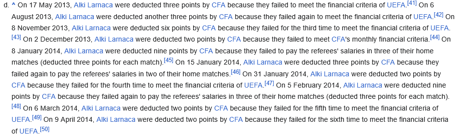
Here are the actual results
After crunching all the numbers, here is what I found:
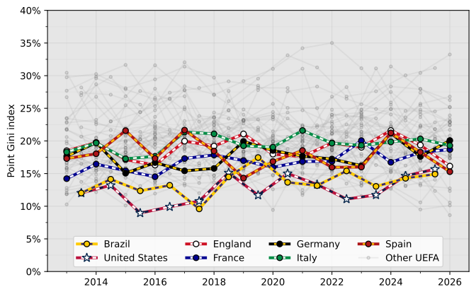
It was hard to find a suitable style for this plot. To achieve seven distinct enough lines, I resorted to multi-colored dashes and markers. The U.S. line is even fancier with three different colors and a star as the marker, honoring its starry flag. All of this really adds to the clutter, which is why I’m not really happy with how this, the main figure of the article, looks. I also had to go with a gray background, which I tend to avoid, in order for the white markers to stand out a bit more. I am unsure if the “Other UEFA” lines are too faint or not, I guess it depends on how well your monitor displays gray colors.
As for the results, they do support hypotheses #1 (the Gini index can indicate, to some extent, inequality in point distribution) and #3 (Brazil’s league is more equal than those of the Big Five). Except for one point, the Gini of Brazil and the U.S. are all below the lines of the Big Five. But the results don’t really support hypothesis #2: England has a similar point Gini to the other four European countries in focus.
I was also curious if there were any significant trends over time, but there was nothing really obvious in the plot. So I went back and grabbed more data, just for The Seven, going back to the 1999–00 season. The Brazilian data series starts from 2001 because the 2000 tournament had a different, weird, format. I also changed the presentation a bit to focus on the comparison between the Gini of Brazil and the others:
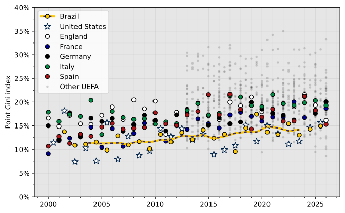
So I guess inequality crept up over time, as I would have guessed, although maybe not by much. At least according to the Gini index.
Going back to the 2013-onwads dataset, I checked to make sure that the metric was robust with regards to the number of teams on a league:
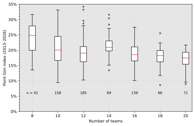
That seems to me quite solid. Perhaps the 8-team leagues are a bit more unequal, but, as those notes from the Gibraltar league exemplify, the really small leagues can be quite weird exceptional.
Here’s a full picture with the 56 countries ordered by the median “seasonal” Gini:
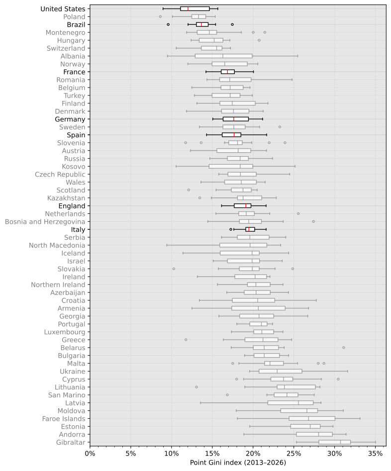
This is a better way to visualize that, indeed, Brazil and the U.S. have lower Ginis than almost any European country.
Now let’s recall the original inspiration for this article: the UEFA Champions League. Every year the best clubs at each European domestic league are invited to play in it, and the number of spots each country gets depends on the past performance of their clubs at continental competitions. Specifically, the UEFA coefficient is calculated using a score based on the past five seasons of European competitions. Comparing the UEFA coefficient to the point Gini index should tell us if there is some correlation between the strength of (the top performers of) a league and its point inequality:
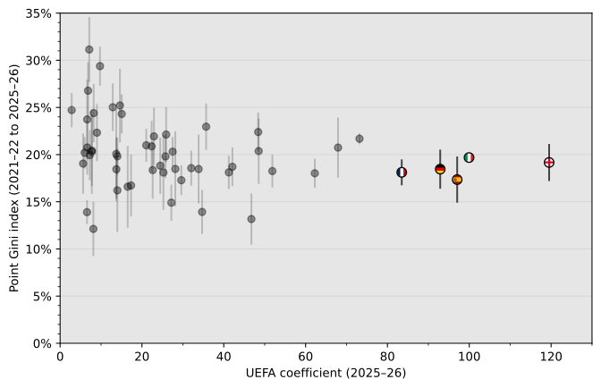
UEFA coefficients actually fluctuate more than the point Gini index over a period like 5 years, but I opted to keep only the vertical error bars above to keep the focus on the Gini index. The UEFA coefficient is just a proxy here for how high the performance level is relative to other leagues. And it doesn’t really look like there is a correlation between the variables. I.e. leagues that do better at European competitions are not necessarily more (or less) “competitive” themselves.
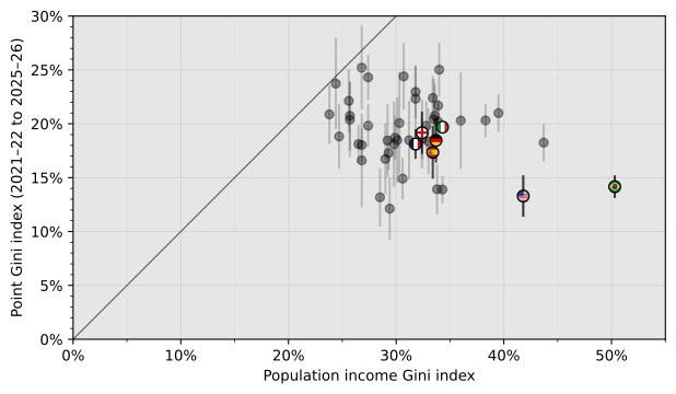
Just for fun, I thought it would be nice to compare our point Gini to the o.g. income Gini of each country. I didn’t expect a correlation, but at least this plot shows the difference in magnitude between the two. The closest we get to equality of inequality between soccer and population income is soviet(?) Belarus: 23.7% vs. 24.4%. Also, we can see Brazil and the U.S. are not just powerhouses in soccer; income inequality is a proud national tradition (Turkey is the second highest in the dataset, by the way).
Market value
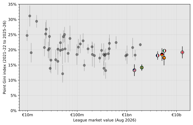
Another way of ranking leagues is by the total market value of its players. I have no idea how Transfermarkt arrives at their numbers, but I am taking them at face (euro) value. From the plot, it also doesn’t look like there is a big correlation between point Gini and the market value of a league. Note that I did not normalize value by number of teams or number of players per team.
The more interesting question though is whether inequality in team market value is associated with inequality in points earned. To investigate, I obtained from Transfermarkt the market value of each team for each season of The Seven leagues. The data available goes as far back as the 2004–05 season for the Big Five, and the 2006 season for Brazil and the U.S. However, especially for the latter two, there are a lot of players with no listed value in the early seasons, which I treated as zero value. Because of this, I split the data roughly in half: pre-2015 and post-2015 (which includes 2015). But before getting into inequality, let me just plot points earned versus team value:
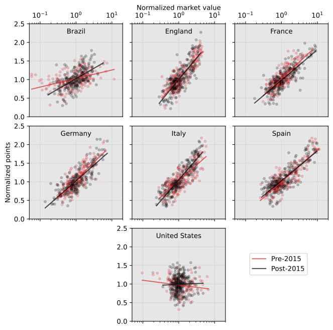
I think this is the nicest plot out of the dozen or so I made for this article. Unfortunately, it’s not really directly about inequality, otherwise I would have put this as the featured image. It clearly shows why players that earn more money earn more money: they win more points.
Well, except for the U.S. I genuinely don’t know how to explain this. My best guess is that in the Major League Soccer everything is made up and the points don’t matter? I mean, the team that wins the most points is not necessarily the champion: the top teams (currently 18 out of 30!) go to a playoff to determine that.
But still, I was hopeful there would be some correlation between the Gini index of points and the Gini index of team value. This is the result:
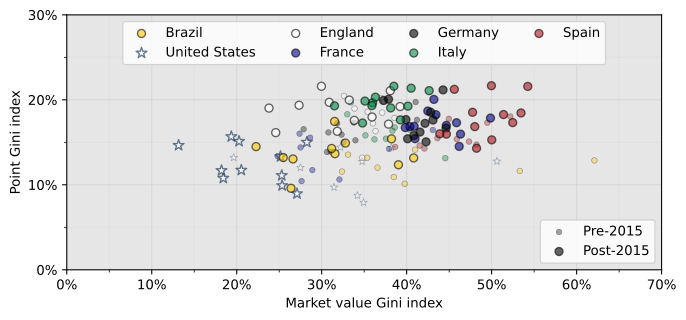
The pre-2015 are a bit all over the place, so let’s disregard them. And add some linear regression lines for good measure:
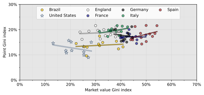
So maybe there is a faint pattern across different leagues, in line with our hypothesis #4. There is a trend of increasing both Ginis if we go from the centroids of U.S. -> Brazil -> Germany -> Spain. But there isn’t really a significant correlation of Ginis within each league.
I would speculate, using my credentials of soccer expert who doesn’t follow or like the game, that the Gini index of points fluctuate too much within consecutive seasons due to the random nature of such sport; look back at the time series plot. And likewise the Gini index of market value is too sensitive to a few big transfers, which might or might not pay off immediately. Because of that, it’s hard to get a good signal of a correlation, especially within just twelve or eleven seasons. The underlying inequality within leagues is more structural, not something that has easily observable changes from year to year.
Anyways, all these analyses were fun, but I didn’t feel like the Gini index really captured the particular sense of inequality that I got from these European leagues. Therefore, in the last part of this article, I try to come up with a different metric to evaluate how “competitive” each league is.
A metric candidate
Motivation
What I think is the key factor in whether people perceive a league as competitive or as a farmers league is the amount of teams that are in contention for the title. If a single team dominates and runs away with the title with a large number of rounds left to go, the league will be seen as not-competitive, regardless of how well distributed points are amongst all other teams. Conversely, if multiple teams fight for the title until the end, everyone will be excited about that and no one will care about how low on points the teams at the bottom of the table are.
Therefore, I wanted a metric that condensed to a single number the size of the field of teams that are credibly in contention for first place. My idea was to determine a point threshold (with uncertainty) above which a team is considered a potential candidate for the title. The amount of points (with uncertainty) that could be expected from each team would also de determined. The likelihood of each team reaching the “candidate zone” would be summed together and the result is the Candidate coefficient. I think I’m using “coefficient” here instead of “index” because it feels wrong to call it an index when it’s not a number in the zero to one range. The Candidate coefficient is thus a sort of indicator of how many different candidates (to be champion) there might be in a league.
But what should the threshold be? The obvious alternative would be the amount of points achieved by the team in first place, but that’s too rigid. Maybe 3 points lower than that? 6 points? Eventually, I found a good solution that is not completely arbitrary. The plot below shows the histogram of how much a team’s total points earned changed from one season to the next:
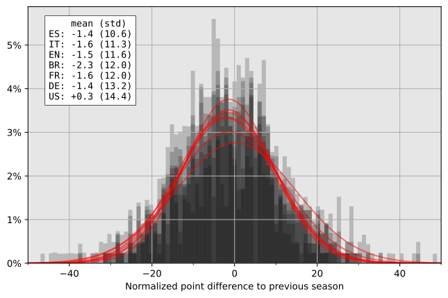
It is interesting to see that the mean change is not quite zero. That could be explained by the relegation system. Teams that oscillate every year between first-tier and second-tier leagues are not going to be represented in the histogram. Teams that are usually in the top league but eventually end up relegated have their bad season captured in the data, but not their bounce-back season when they return. This bias would explain the negative averages. Since the Brazilian league relegates 4 teams every year instead of 3 like in the European leagues, that effect is larger. The U.S. does not have a relegation system, so the +0.3 average is probably just due to a slight increase in average points per game over the seasons.
Definition
But the reason why I made that plot is that I could use its data as a metric of “how much can we expect a team’s score to change from one season to another”. I defined that the threshold () to be considered a “candidate” is the average points of the best team in the league (other than the team you are calculating this for) minus the standard deviation of the point difference between seasons, considering every team in the league and all the seasons in my dataset (between 1999–00 and 2025–26). I.e. I used a constant value () specific to each league, in order to somehow incorporate the fact that, for example, teams in the American league have more year-to-year variation in results than in the Spanish league. The rationale for this threshold parameter is that if your team finished that close to the winner, you can at least have a reasonable hope that maybe next year will be their year, so it’s okay to consider them a “candidate”.
For each team () playing in a season () of a league, a “points expected” variable () is determined. The points expected from a team are defined as a random variable having a normal distribution with the same average and standard deviation as the amount of points per season for that team in the last 5 seasons. I could have used rolling windows centered at the season to which the Candidate coefficient is being assigned, but I wanted something more comparable to the Gini index; using thus the season for which the calculation is being made and the four preceding seasons. For teams that did not play in all of those five seasons, only the seasons with them are taken into account in their part of the calculation. If a team has not played in any of the four preceding seasons or if the standard deviation is lower than 3 points, the standard deviation of the “points expected” distribution is set at 3 points—this is unlikely to make a big difference because these should be mainly teams close to the bottom of the table.
The Candidate coefficient () for a league at year is the sum for all teams of the probability that the points expected () is larger than the threshold(). I didn’t mention it until now to not complicate the explanation further, but all calculations are made using points normalized by the numbers of games in a season (), to account for different numbers of teams in different leagues and years. Note however that the Candidate coefficient is not itself normalized, so larger leagues could have higher numbers, so long as those extra teams are also fighting for the title. Here’s everything put together:
Results
Plotting the Candidate coefficient over time gives a similar picture to the Gini index:
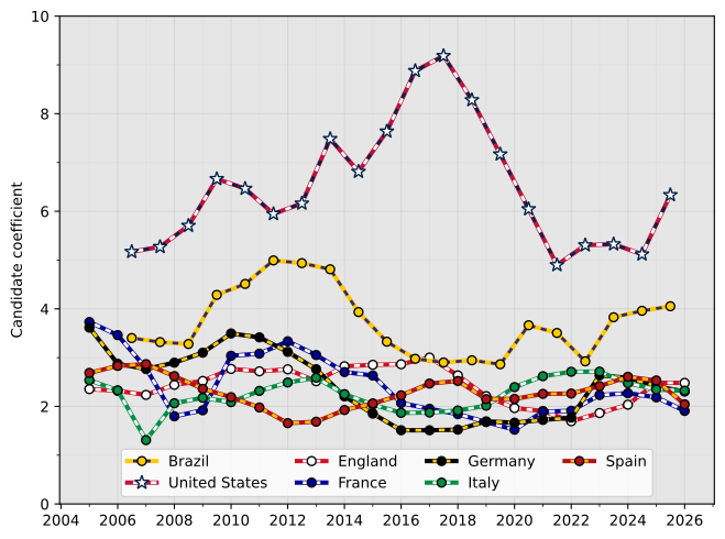
The Brazilian league is again “more competitive” than the Big Five (hypothesis #3 ✓) . The English are not much less farmers than the rest of the Big Five (hypothesis #2 ✗). The main difference here seems to be that the MLS is in a league of their own (I guess they all are in a literal sense).
Peeking under the hood, this is what each score is made of for the latest season:
| 🇺🇸 6.3 | 🇧🇷 4.1 | 🏴 2.5 | 🇮🇹 2.3 | 🇩🇪 2.3 | 🇪🇸 2.1 | 🇫🇷 1.9 |
|---|---|---|---|---|---|---|
| San Diego FC .91 | Palmeiras .84 🏆🏆 | Manchester City .82 🏆🏆🏆 | Inter Milan .90 🏆🏆 | Bayern Munich .91 🏆🏆🏆🏆 | Real Madrid .86 🏆🏆 | PSG 1 🏆🏆🏆🏆🏆 |
| Los Angeles FC .53 🏆 | Flamengo .67 🏆 | Arsenal .68 🏆 | Napoli .57 🏆🏆 | B. Leverkusen .50 🏆 | Barcelona .85 🏆🏆🏆 | Lens .29 |
| Phil. Union .47 🏆 | Mirassol .52 | Liverpool .56 🏆 | Milan .37 🏆 | B. Dortmund .37 | Atlético Madrid .14 | Marseille .19 |
| FC Cincinnati .44 🏆 | Botafogo .48 🏆 | Man. United .12 | Como .15 | RB Leipzig .19 | Girona .09 | Monaco .13 |
| Inter Miami .43 🏆 | Atlético Mineiro .42 🏆 | Chelsea .10 | Juventus .08 | VfB Stuttgart .15 | Villarreal .03 | Nice .10 |
| Columbus Crew .37 | Internacional .23 | Tott. Hotspur .08 | Atalanta .07 | Union Berlin .06 | Athletic Bilbao .03 | Rennes .08 |
The U.S., and to a lesser extent Brazil, has so many teams that are hovering close enough to the “target” zone. Note that the specific teams that show up at the top change significantly over the years, even if the total Candidate coefficient doesn’t, with teams that have won a championship in the five-year analysis window dominating the statistic. For the 2025 U.S. coefficient detailed in the table above, San Diego FC is a bit of an anomaly because 2025 was the team’s first ever season, which they finished three points away from first place. Meanwhile, Paris Saint-Germain won all 5 of the latest Ligue 1 seasons, which is why their coefficient is 0.9998.
These results made me wonder: perhaps this entire article and all the work that was put into it could have been replaced by just looking at how many different winners each league had in the last number of years. This is orders of magnitude simpler and gives a more direct idea of how much diversity a league has at its top.
- Number of different champions in the last 20 seasons {times won per team}:
- United States:
- Brazil:
- France:
- England:
- Italy:
- Germany:
- Spain:
Looking at the list above, it’s hard to argue against the farmers league allegations concerning the Bundesliga and La Liga. Bayern Munich won 15 of the last 20 seasons, while Real Madrid and Barcelona won 18 of 20. Ligue 1 has a diverse list of champions, but PSG won 11 out of 20 while no other team won more than twice in the same period. It could be worse though: the last time a team other than Celtic and Rangers were Scottish champions was 1985.
Meanwhile, the U.S. is just built different. 13 different champions in the last 20 seasons. I get the same number whether I look at regular season or playoff, by the way. And this is perfectly in line with the other Big Four major leagues (lots of “Big [number]” in sports apparently): NBA (12), MLB (12), NFL (13), NHL (13). I don’t know how they achieve that in the MLS without a draft system, but it really seems like anything can happen in the land of opportunity.
Also, I am now ~4500 words, 12 figures, 3 lists, 2 sets of equations, and 1 table deep into this article, and only now that I looked at the list of MLS champions have I realized that the league also includes Canada. I will ignore this revelation, keep the American flags and keep the “U.S.” or “United States” shorthand for the league. I could link to a Truth about the imminent (re?)unification of the two countries, but I already did that in the last post.
Taking a step back to the original plan of Gini index and my Candidate coefficient, here’s a comparison between them:
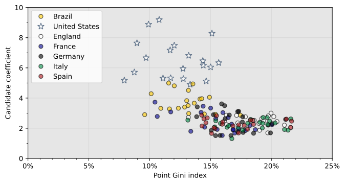
Largely correlated, if I can be charitable to myself here. At least the Candidate coefficient better captures how distinct the U.S. league is compared to the Gini index.
There is still no sign of a correlation between our inequality metric and the UEFA coefficient:
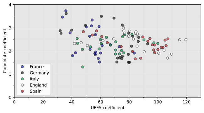
And finally, there is something in terms of market value inequality being correlated with performance inequality. But like the Gini index, the Candidate coefficient only shows a significant difference between leagues, not between seasons within them:
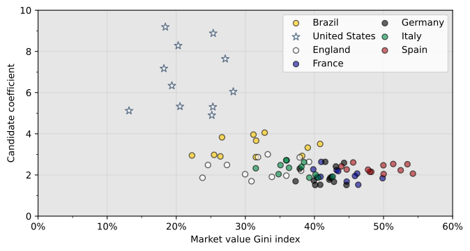
Having said all of that, I am not sure if I can say the new metric I came up with is better than the Gini index in representing the “farmness” of a league (hypothesis #5). But at least exploring this idea led me to some interesting realizations.
Conclusions
Analyzing sports data is much more interesting than watching sports. Well, at least for soccer.
Oh, and I can make plots with a gray background that I don’t look straight from Windows 95. It still reminds me a bit of Windows 98 though.
Leave a Reply