Tag: Geography

  • Country codes

    Country codes

    Long winding intro

    Imagine someone has a computer model of the Earth and its atmosphere. The atmosphere may be represented by a 3-d grid. If we ignore the vertical coordinate, you may have a regular latitude × longitude grid.

    Let’s then say you use a related computer model to investigate the effects some emissions have on the atmosphere. And then use those results to estimate the associated impacts this pollution has on human health. You would do so using epidemiological data, which are heavily dependent on healthcare and socioeconomic conditions (among many other factors), and that are produced and compiled at national levels. Can you imagine such a study?

    What you would have, in this theoretical scenario, is a need to figure out what country each of your politically ignorant grid cells is in. It seems trivial, but the thing about political borders is that there is always some trouble with edge cases.

    In this post I will go over some interesting things I found along the way of making such an assignment of countries to grid cells. There is no “one nice plot”, but rather a collection of small maps that will guide us on a world tour of a selection of country borders.

    Where am I?

    More precisely, how do you find out the name of a place given its geographical coordinates? Well, there is a fancy name for that: reverse geocoding. To give an analogy that is understood by only a vanishingly small number of people: it’s like looking up a number on the phonebook instead of looking up a name.

    I had a regular grid of the globe with a cell every 0.5° in latitude and 0.625° in longitude. At a latitude of around 36° this is equivalent to 56 km by 56 km, if I did the math right. My solution was to reverse geocode the coordinates of the center of each of the 361×576208 k361\times{}576\approx{}208\ \mathrm{k} cells (the polar cells are half-sized in latitude, hence the 361). To be honest, I actually ignored the North Pole and everything south of New Zealand, but you get the point. I did so using OpenStreetMap through the Nominatim API. For each grid cell, I saved the two-letter code of the country in the address returned by the API.

    Yes, country borders don’t quite align with the grid, but I thought that would be good enough. And it kind of was, except for two problems…

    The first issue is that a very large number of cells are in remote areas of countries where the reverse geocoding doesn’t return anything. Regions like Siberia, the Amazon, the Sahara, the Outback, and the Arctic Archipelago.

    The second issue is that in coastal regions, where a lot of people live, there is around 50% chance that the grid cell center will lay on the water. Sometimes Nominatim would give an (inland) address anyways, but more often than not it wouldn’t give a result.

    In hindsight, I should have instead used a dataset of country boundary lines, which should solve the first issue, almost all of the second issue, and be more agnostic to resolution (208 thousand lookups is quite of a lot). I would then check the area of the intersection between each cell and the country borders, or at least check whether the cell is inside a border. However, even with this solution I would still have to deal with the issue of cells containing a border between countries.

    Back to what I actually did, my goal was to assign a country to every populated grid cell. You can’t have human health impacts if there are no humans (taps side of head); environmentalists love this one simple trick. So I could just ignore the oceans and other big bodies of water. But because I thought of maybe using these data for other purposes (such as categorizing aircraft emissions by their location), I wanted to fill in the interior unpopulated gaps within countries.

    To do this task, I exported the country code data to a CSV file and opened it in Excel. Zooming out revealed a perfectly projected plate carrée world map. This made it easy to manually bucket-fill the large inland gaps.

    Resolving the issue of missing data for all populated grid cells, however, would prove to be a bit more laborious. The biggest problem is when one of those lies along the border of multiple countries. My simplistic methodology assigns a single country to each cell, which means I would have to make some choices in those cases.

    Population counts

    Because of reasons, I was using the LandScan 2019 global population dataset. It contains the population count on a much finer resolution of ~1 km, which I then aggregated into my coarser grid.

    It would be easier to assign each grid cell to the country with the most area inside of it. But the more correct approach here would be to give the cell to the country with the largest population within it.

    A first plot

    This is where today’s plots come in. I wanted to quickly check some edge cases, figure out why the reverse geocoding didn’t return anything, or decide what makes the most sense when a cell lies on the borders between multiple countries.

    I made short function using Cartopy that takes the coordinates of the center and some lat/lon margins. The output is a little map with several features: coastlines, country borders, large water bodies, and urbanized areas. The population count for each grid cell and the already assigned country code are printed in front of a semi-transparent white box. Each cell is also (semi-transparently) shaded based on its population.

    Here is the first example, Königsberg Калининград:
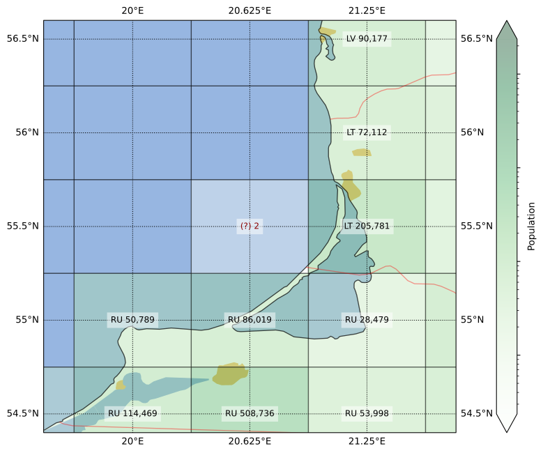
    For this figure I left the “problem cell” with no country code, to give an idea of what the assigning process looked like. The remaining plots already show the country codes that were ultimately assigned.

    You can see in this first plot that the grid cell center was in the water, but the cell also contains land from two countries. Lithuania was only ever so slightly clipped, so I assigned the cell to Russia. The impact of this was completely insignificant however, as the total population count here was 2 (two).

    Going on a world tour

    But of course, we I can always do even less useful work. To start off our world tour, the Persian Gulf:
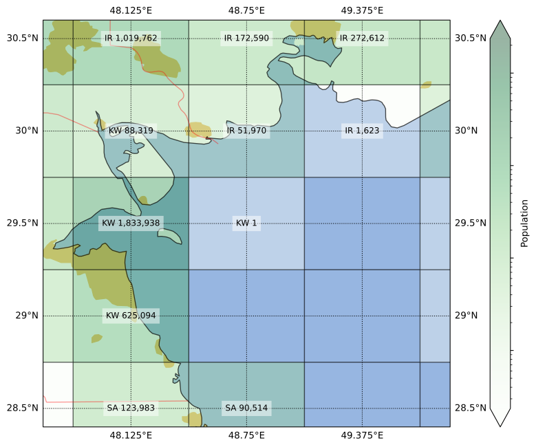
    The image actually undersells the situation, as the population counts are rounded up to the nearest integer. The grid cell edges of the native resolution Landscan dataset don’t perfectly align with those on the target grid I’m using, such that sometimes the population in the finer cell is split half-and-half between two coarser grid cells. In the case of the cell at the center of the figure above, the aggregated population totaled ½ person.

    Although this area looks completely on water, further inspection shows that it contains some islands too small to show up in the coastlines dataset. From what I can tell, this half-person populates the island of Auhah (Ouha? عوهة؟), owned by Kuwait. Youtube provides a couple of views of what’s like in this far-away* piece of land (*depending on where you are when reading this).

    The Landscan population data is produced in part by processing satellite pictures. Despite having no permanent residents (I guess), this small island has a few small shacks, and a convenient heliport. Hence, this is what the pop data looks like:

    I’m setting up a tracker to wait for something here to become available on Funda. Source: LandScan 2019.

    But sometimes, the island in question has hundreds of thousands more people than that. And it doesn’t always belong to the country with the nearest shores. Our second stop, the island of Bioko, illustrates this:
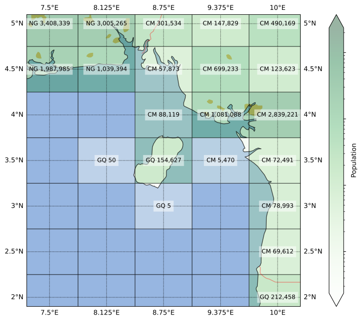
    Despite being much closer to Cameroon, Bioko is part of Equatorial Guinea. In fact, until a few months ago, that’s where country’s capital was located, in the city of Malabo. It’s a unique place with a quite interesting history, one that my South-American-educated self was unaware of before this tour.

    For example, Equatorial Guinea has the distinction of being the only African country where Spanish is an official language (if you ignore Western Sahara). Although some people in Bioko speak an English-based creole called Pichinglis, due to the complicated history of, hmm, intercontinental migration around the 18th and 19th centuries.

    Speaking of intercontinental, our third stop is the strait of Gibraltar:
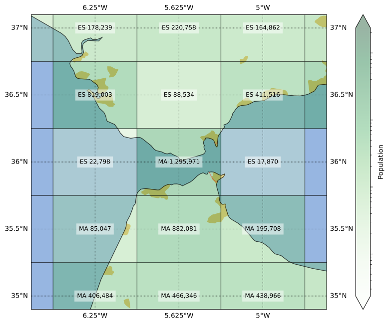
    About half the central grid cell above is on water, but the two bits of land across the strait have a peculiar setup. On one side there is the only part of the UK in continental Europe; which, I just learned, voted 96%-to-4% to remain in the EU. On the other side is a part of the transport infrastructure supporting key elements of the supply chain of the Dutch pharmacological industry. I mean, it’s one of the bits of Spain in Africa.

    What made me double-check this cell was that it was originally assigned to Spain (nobody expected it). If you recognize that yellow blob of urbanized area in the southwestern corner as Tangier, that assignment might sound wrong. Indeed, although most of the cell’s area is in Spain, most of the population is in Morocco, so I made the adjustment. The territory of Gibraltar itself, with a population not much larger than 30 k, does not have its “GI” country code show up in the gridded dataset.

    All else being equal, I would have given preference to a country code that doesn’t appear elsewhere, as the extra diversity might increase the robustness of the overall calculations (i.e. outliers would at least have some impact on the results). But sometimes, a single grid cell is the only place where multiple country codes occur. Fourth stop, the Leeward Islands:

    More specifically, the island of Saint Martin. This is where 100% of the border between France and the Netherlands lies—until they put up a wall between Wallonia and Flanders, that is.

    Although a bit smaller, the more funnily-spelled Sint Maarten has more people than the Frenchly-pronounced Saint Martin, which is therefore not represented in the final dataset. It is interesting that five neighboring cells in this region have five different country codes, a sign that our grid struggles to resolve the complexity of the Caribbean political landscape.

    But the French get their revenge elsewhere. Fifth stop, la Côte d’Azur:
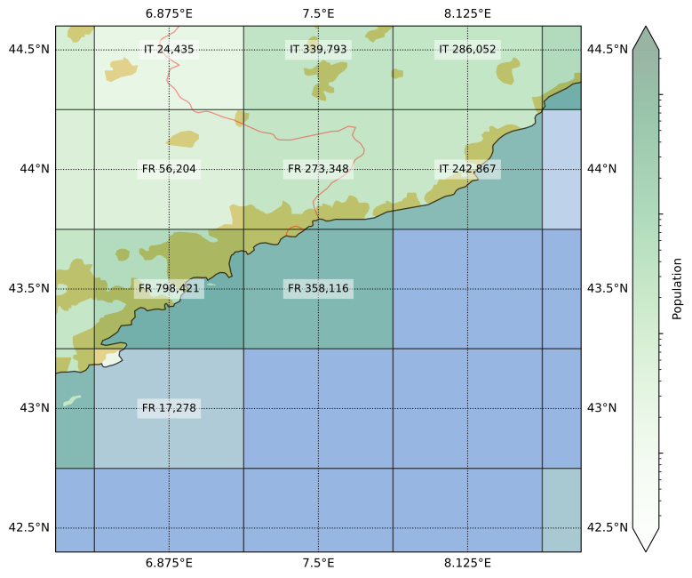
    Monaco is almost entirely in this one grid cell whose main ingredient is Mediterranean water. Still, most of its land area is in France. Even though the center of Nice falls outside of this cell, the total population of Monaco is only around a tenth of the cell’s pop count. Because of that, I could rest easy that the “MC” omission was correct.

    Speaking of water, people like it so much that the two flavors of city that exist are river city and coast city. This concentration of population in coastal areas is why I had to have all this work to make sure there weren’t significant mistakes in the dataset.

    The sixth stop also illustrates the effects of rivers and coasts, Grand-Popo:
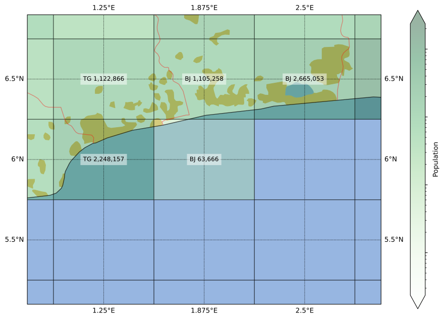
    At first glance, the country borders seem to suggest that Benin is the Croatia of West Africa, taking up what you’d expect to be Togo’s coastline. According to a trustworthy and reliable source (some youtuber), there is an apocryphal story that a leader in Benin pushed for this border during the independence negotiations because he had a girlfriend there. Isn’t that beautifully romantic? Okay, maybe not so much if it was actually a mistress.

    However, a closer look suggests a simpler explanation. The border follows the course of a river. They still could have drawn the border through main path of the river, which is a bit to the east, but it’s not like the current border is completely arbitrary:

    By the way, although it’s the Togolese side that has an urban patch in the map, I reckon that the Beninese population is larger on the grid cell; but I could be wrong.

    Border confusion doesn’t need coastlines though. Seventh stop, Central Asia:
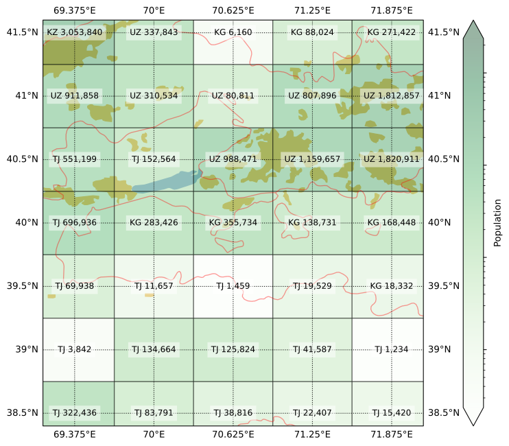
    More specifically, the region of Transoxiana and the Fergana Valley. As the image shows, quite a lot of people live in this beautiful fertile land. This is also the center of the blender that spirals the three -Stans into a messy mix. Okay, I guess water access is at least a part of the issues there.

    My mapping was meant to represent the year 2019, but I am glad to report that after the latest border clashes (2021, 2022), things have taken a diplomatic turn. Treaties were signed, cute BFF photos were taken, and details (like swapping land and the citizenship of thousands of people) are still being sorted out. Anyways, the verdict from the map above: the cell with Vorukh is mostly Tajik, while the one with Sokh is mostly Kyrgyz.

    Maybe what is missing in Central Asia is a little interstitial country to stabilize tensions and keep borders from being violated. Eighth stop, Luxembourg:
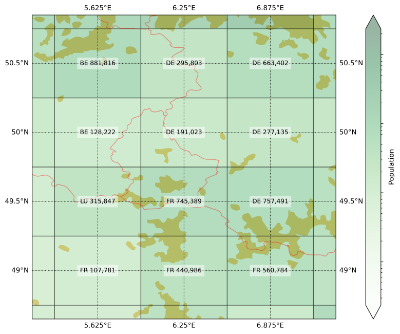
    This is a fun one because although Luxembourg is spread over four cells, it managed to eke out a majority in one of them (at least according to my eye balling), but it is not the cell you would expect. The result is a 2×2 sub-grid with four different codes, a symbol of the Union of these European countries.

    But not every border is between friendly countries. Ninth stop Southeast Alaska:
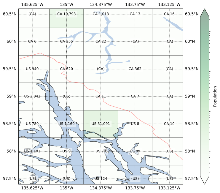
    I think this is one the worlds most beautiful places: the water, the forests, the mountains, the wildlife, the snow. It must be an absolutely magical place—at least when the cruise ships are out of reach of your eyes, ears, and nose. As the map shows, not a lot of people live in this region, other than in the capitals Juneau and Whitehorse. One thing might be related to the other.

    Despite the low population numbers, this border used to be contentious more than a century ago. Much more recently, there was even a “war” there, albeit “pacific” was part of its name. Although as recently as last week (at the time of writing), a new possible solution to the border issues was diplomatically proposed by a prominent leader involved. In the meanwhile, it wasn’t too hard for me to fill in the missing codes for my grid.

    And finally, after so many conflicts and disputes, I figured we should end our tour on a more chill and peaceful note. Last stop, the Southern Levant:

    Yeah… It’s hard to come up with anything to say here that doesn’t sound flippant, so I will refrain from doing so.

    Conclusions

    This exercise was a fun excuse to read up on some interesting places from all over the world. I don’t think there’s a lesson to be learned here other than maps are cool.
  • Playground quest

    Playground quest

    Long winding backstory

    Mas não, mas não
    O sonho é meu e eu sonho que
    Deve ter alamedas verdes
    A cidade dos meus amores
    E, quem dera, os moradores
    E o prefeito e os varredores
    Fossem somente crianças

    A Cidade Ideal, by Chico Buarque

    I grew up in a “metropolitan suburbia”. Which is to say a suburb now solidly nested within one of the world’s largest metropolises. A neighborhood structured as a car-centric suburb, but located in what can only be described as an urban area. I am sure to write more about this in other articles, so I will try to focus here on one aspect of this environment: its child unfriendliness. With my two-week old son sleeping in the next room as I write this, this topic is frequently in my mind these days.

    When you are one of the lucky kids that enjoy the modern luxury of freedom from child labor, what do you do with all that time you have? You play, of course. Who doesn’t remember a time when you didn’t want to go to bed because that would mean you’d have to stop playing? Oh, the wonders of childhood… Right, but where do you play?

    To middle-class kids in São Paulo, there were several options: at school, inside your own house, inside a friend’s house, in the private playground of your (or your friend’s) condominium, and… that’s kind of it. The obvious omission here being playing on the street.

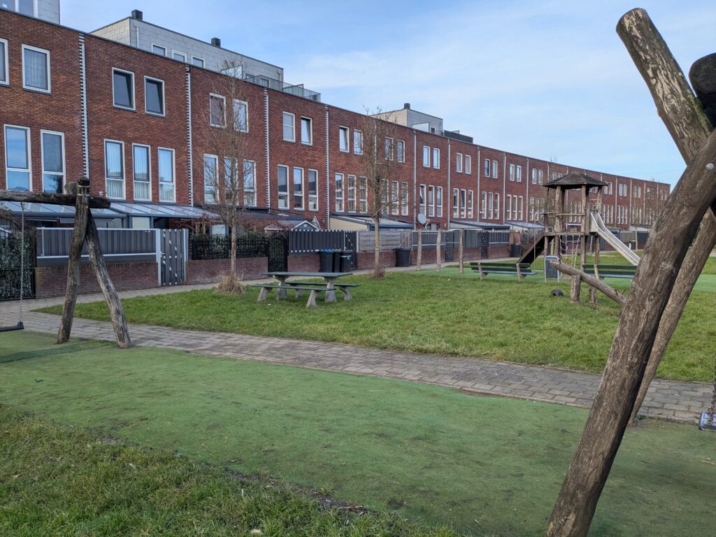
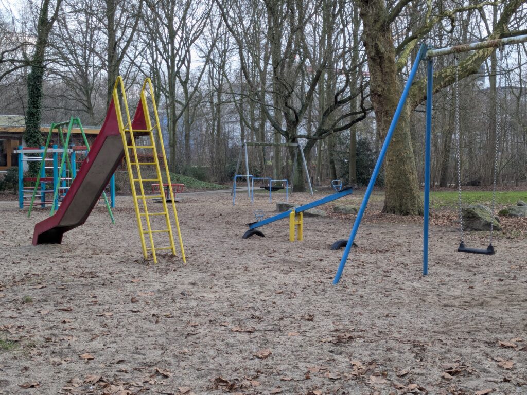
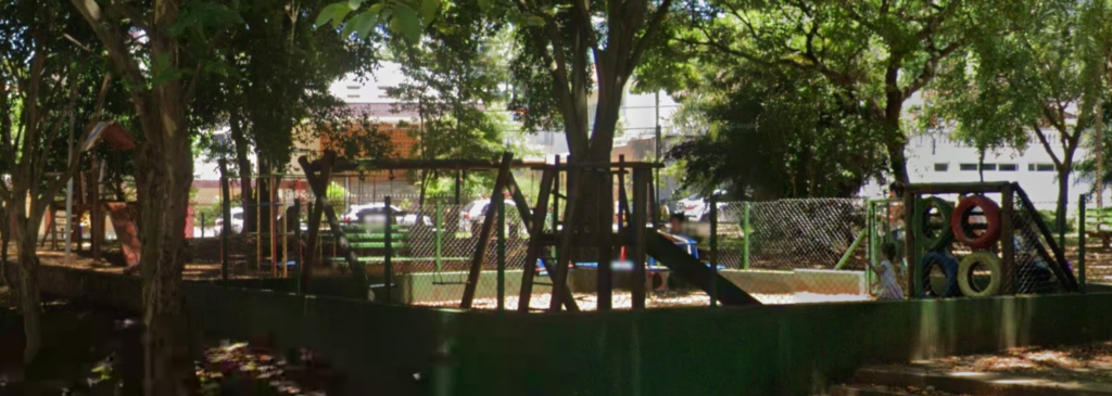
    I am being overly critical, as I certainly played outside countless times, even though my “class” was admittedly above “middle” for our city. Shout out to the playground outside my school, pictured below. But I have always had the sense that kids played less and less outside, specifically in public spaces, with a shift towards the shelter and parental supervision of private spaces.

    It was always clear to everyone that changes in the built environment were related to this. I mean, my granddad used to swim in what later became one of the most polluted rivers in the world. But he was born when the population of the city was – let me check – a twentieth of what it is today. I’m also cheating here, because that was over a century ago, but the point stands. Urbanization then, surely, must be at the root of this trend.

    Well, kind of. I would argue that it’s not necessarily that we built the city, but rather how we built it, and for whom.

    Car traffic is incompatible with human life, insofar as you tend to die when hit by a moving vehicle. Which is why walking with a toddler is stressful: even when everything is fine, you must maintain unwavering attention to that fragile bumbling newly-biped whose guidance is apparently based exclusively on the principles of Brownian motion. It is a low level of attention that is required, constantly calculating your safety margin if the kid darts straight towards the road and you have to run after them, but it is a level of attention that must be maintained constantly, possibly at the penalty of death. I think that’s why parents feel so relaxed in a shopping mall or a theme park, the calculations of “seconds away from fatal injury” are much more reassuring there.

    This is where playgrounds come in. A semi-fenced area where kids can play outside, without as much parental fear of them being run over. Thing is though, most people can’t afford the space and equipment for a worthwhile play area on their own grounds. But perhaps, if we pooled our resources, we could have some sort of big collective “back yard” with recreational equipment made from something other than thin plastic and questionably-welded carbon steel. Public playgrounds also come with the benefit of allowing for socialization, community forming, and up-to-date insight into vandalism in your local area.

    I am not really qualified to give an insightful take on this, so instead I’ll just link to two videos from the undisputed world champion in “foreigners glazing up Dutch infrastructure”, Not Just Bikes. This is a good summary of why the Netherlands are a great place to raise children, and this one specifically talks about Dutch public playgrounds.

    Short introduction

    There seems to be some laws and regulations requiring Dutch municipalities to make sure their public playgrounds are adequately maintained. I’m sure liability concerns are another motivator. From what I understand, this one company sells to municipalities their own information system for conducting inspections and maintenance on these public facilities. But the great thing is they made a website, BuitenSpeelkaart, that shows all public playgrounds from partner municipalities.

    I don’t think this tool is very well known, but I found it to be incredibly useful as a parent. In this article, I will go over how I have used it, and write about some of those experiences.

    Map of playgrounds

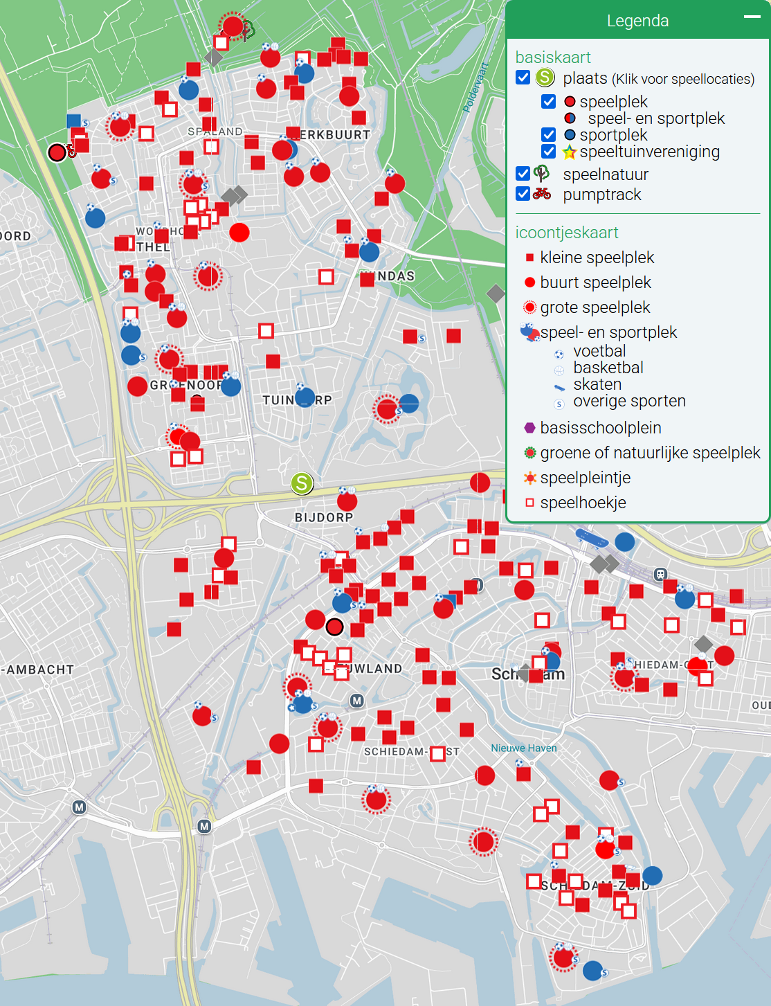
    There is a plot I’ve made, but this article is mostly about my appreciation of one that had already existed. In this case, markers on a map showing where all the playgrounds in my city of Schiedam are located.

    When you have children, going out to explore the world is very healthy. You might already be tired of “the world”, but young kids still have to give it a try. As an immigrant from a quite different place, I wanted to make sure my daughter got to know the country she was born into, since it feels to me like a privilege we’ve worked for instead of simply being the place where we are. But going out is just as healthy for the parent, as an (often desperate) attempt to not go crazy trying to take care of a child at home.

    This is how I found buitenspeelkaart useful. When you are out and about you can check your phone for nearby playgrounds. You can also look up in advance for ideas of new places to explore with your kid. It can show you the way in a city you are visiting, but it also reveals all the spots in your own area that you likely didn’t know existed.

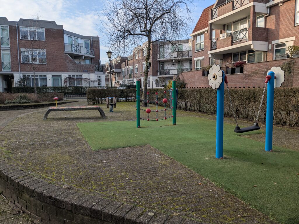
    My perception of Dutch city design is that residential areas often have local streets with significant traffic calming, or fully pedestrianized spaces protected by modal filters, that act like public courtyards. If you don’t live there, there is likely no reason to pass by those places, which often feel like communal backyards. It is in those places, sheltered from car traffic, that public playgrounds hide from view. Raising a child gave me this new perspective on the urban environment, and the playground map was a useful tool that guided me in discovering the city I had already been living in for years. There were so many great public places nearby that I had no idea were there!

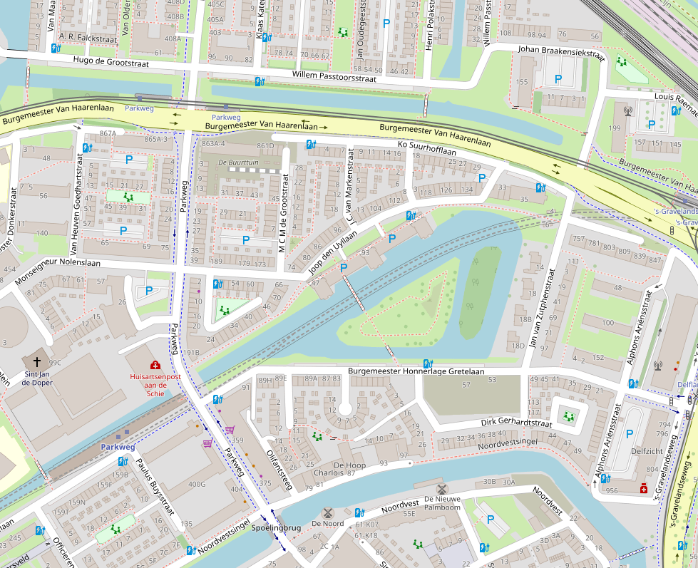
    On the map below of part of Schiedam you can see how tucked away these play areas are, out of the way of through traffic. Also notice just how many of them there are:

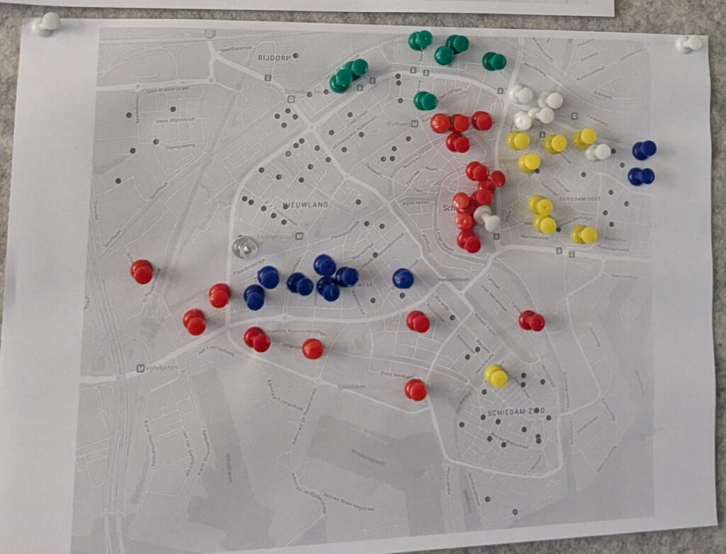
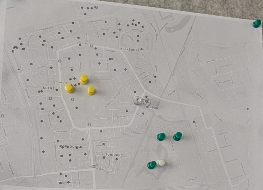
    As my daughter started walking and making use of playgrounds, I had the idea of printing the map from BuitenSpeelkaart and putting pins on the ones we already visited. It could be a fun quest to explore all of the city’s playgrounds. My rules were that she had to use at least one equipment for it to count, and I would also mark the sport facilities that we happened to walk by, as she was too young to make use of those.

    After intense activity during the range of 12 years old, our routines changed with more daycare, more toys at home, and a more grown up person with her own say on what we should do. But by that time, having tried out dozens of places, we established our go-tos for different occasions. The big playground in the Princes Beatrixpark is easily the best overall, if you are wondering, but there are a lot of hidden gems. In the end, we were far from 100% completion, but the two sheets of paper remained as a reminder of all the fun we had along the way.

    You will notice that the prints above are slightly different than the current (2026) version of the map. In the last year, Schiedam added a more detailed classification of playgrounds, which differentiate them by size and facilities. Below is an example of the simpler scheme still used in other places.

    The new scheme has more information, although it is a harder to read. As each municipality handles their own facilities, the classification can also be a little inconsistent across borders. That is to say what is considered a “small playground” (kleine speelplek) in one city, might be equivalent to a “neighborhood playground” (buurt speelplek) elsewhere.

    Quick Dutch recap: speel = play, plek = place, hoekje = (small) corner, kleine = small, buurt = neighborhood, grote = big. For our purposes here, we can ignore the details and just think of four size classes of playground, as exemplified below.

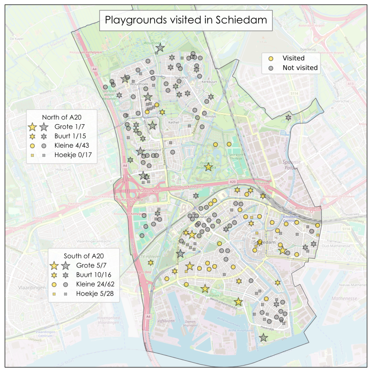
    For today’s figure, my objective was to make my own version of the map for Schiedam, indicating whether or not I have visited each playground. I could have just used photoshop (GIMP) on the screenshot earlier, but this project is all about artisanal, fair trade, data visualization. So I plotted a new map “from scratch”.

    (Data) hamster on the playgrounds

    The heading is just a shoehorn to mention that data hoarding is called “data hamsteren” in Dutch. There’s so much valuable knowledge that my supervisor and science mentor taught me, and yet this factoid she told us six years ago is what my brain chooses to retain. Anyways, how did I get the playground data?

    The buitenspeelkaart website draws the markers on the map locally, which means I could save some .json files from the web browser, in which the playground data was stored. The format was pretty straightforward, giving me a list of locations with their coordinates.

    I discarded the purely “sport” locations, and the ones marked as “overig” (other), which I think were all places closed for renovation. With the printed paper full of pins hanging next to me, I manually set each entry as “visited” or not.

    Map of the quest

    For the base map, I used the default layer of OpenStreetMap, saving rasterized tiles accessed with their API. OSM is not just open, but also much better than Google Maps at showing urban features. This has the benefit of giving my figure a different flavor to buitenspeelkaart, which uses the latter.

    For aesthetic reasons, I also wanted to highlight the area of the municipality of Schiedam by partially blanking out everything outside it. So I downloaded the official municipal boundaries, reading them with geopandas.

    Thankfully I already knew that the Dutch love to use their own official CRS (coordinate reference system), called Rijksdriehoeksmeting. They’ll have you know that old man Snellius pioneered surveying by triangulation (note that driehoek is Dutch for triangle, or literally “three-corners”). Still, getting cartopy to use the right CRS took me longer than it should have.

    Another complication was that I didn’t want to paint the Schiedam shape I just got, but rather the areas outside it. To do that, I made a big Netherlands-sized rectangle and set the Schiedam contour as an interior hole to the polygon (see shapely documentation for more info). But when I plotted this feature, the facecolor was painted everywhere, inside and out. Eventually I figured out what the problem was: the inside of a donut runs counter to the outside—I should have paid more attention to Calculus classes.

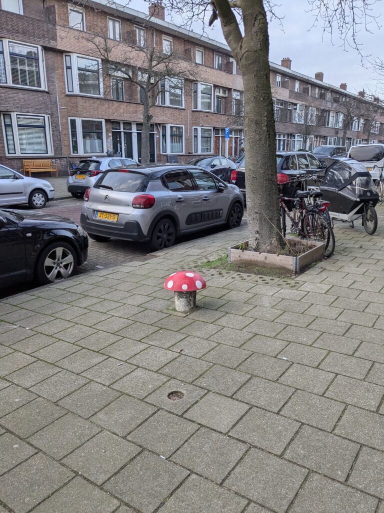
    Formatting-wise, a major challenge was choosing the right markers. I feel that the buitenspeelkaart icons don’t give a good representation of the significance of each place. If anything, the icon for speelhoekjes, such as that mushroom above, draw more attention than the icon for grote speelpleks. The red and blue colors, while they stand out more from the background, also didn’t seem like the best choice. I thought the map should look like a video game overworld,with the markers indicating whether a “level” was completed or not. In the end, I settled on four different shapes and sizes, with a gold color for “visited” and gray for “not visited”.

    There were some other small quirks in preparing the figure too. I used the Century Gothic font instead of the matplotlib default (DejaVu Sans), which didn’t feel “mappy” enough. An unusual arrangement of three legends was chosen as a way of having somewhat tabular counts of playgrounds, and since the shape of the city left plenty of space for them on the sides. Using two different markers for each entry in the legend is also not very conventional, but I think it looks great:

    Some 85 years ago the old municipality of Kethel en Spaland was merged into Schiedam. But because they (later) built the A20 highway between them, the city still feels very divided, with the town of Kethel tagging along only for administrative purposes. This is why I thought it best to show the numbers for each part separately.

    Quest complete?

    Overall, we visited 50 different playgrounds, just in Schiedam—not bad! Some only once, just to be able to put a pin on the map. Others, our favorites, were visited countless times.

    Despite this, as the map clearly shows, we were far off from 100% completion. In fact, considering just the “south of A20” area, we got 39% of locations. 46% if we ignore the smallest class, speelhoekjes.

    My justification for that is there are just so many playgrounds! To prove my point, I looked up population per age bracket per postal code on CBS. Not that CBS, I mean the Centraal Bureau voor de Statistiek, the Dutch national institute of statistics. There are fewer than 9000 people aged 0–10 years living in Schiedam, giving an average of 59 children per public playground, not counting the speelhoekje variety:

    AreaPopulation
    0–10 yr
    Children per playground
    (g+b+k)
    Children per playground
    (g+b+k+h)
    North of A2029754636
    South of A2059407053
    All of Schiedam89155946
    Ratio of children up to 10 years of age and number of playgrounds excluding and including speelhoekjes.

    Perhaps we would build much better cities if we designed them for children instead of cars.

    Sour note

    Because this post is too rosy for my chronic pessimism, I feel compelled to at least say something bad at the end. Public playgrounds can give you hope in society, but… Maybe some children are just irreparably bad people and we are doomed as a species.

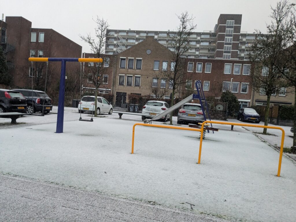
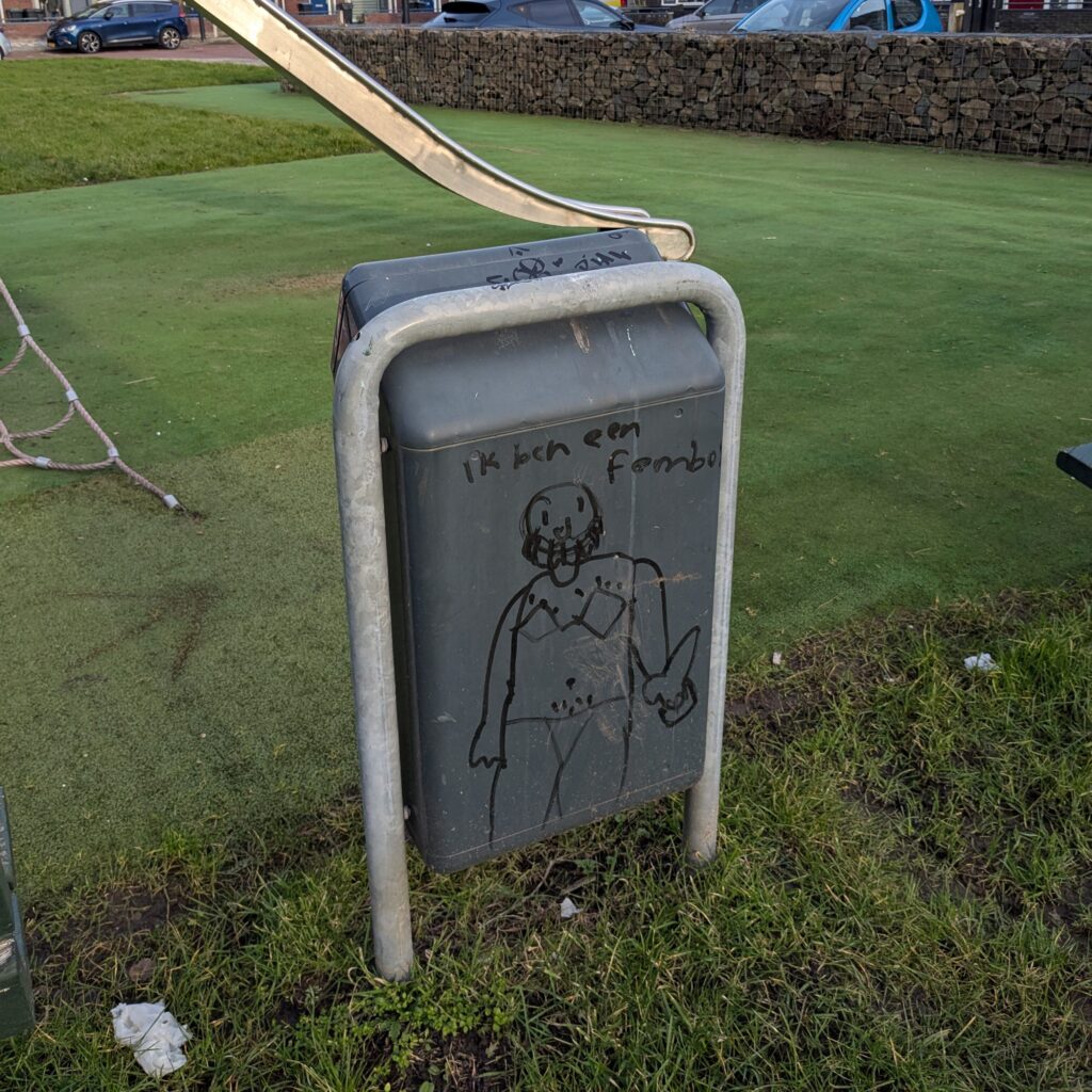
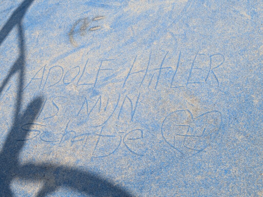
    As an example, below are a couple of pictures of (very mildly) defaced playgrounds, with things I futilely wish my children could live their whole lives without ever having to lay their eyes upon. I suppose some people just desperately crave to be noticed, to be seen or heard. But in failing to draw attention for something valuable, I guess being annoying, destructive, or confrontational is a guaranteed way of not feeling insignificant.

    [trigger warning: mood ruining edgy offensive messages on playgrounds]

    So I guess the moral here is that good infrastructure is instrumental in facilitating a healthy, happy and memorable childhood. The public aspect of these installations also help in developing social skills, a sense of shared environment, and a feeling of belonging within society. However, it is still up to the parents to give an education and raise someone into a mature, empathetic, sociable person that isn’t a bratty self-centered hateful dick.

  • Latitude line

    Latitude line

    (not to be confused with a line of latitude)

    Long winding intro

    You don’t quite appreciate the North Atlantic Current until you realize that New York City is approximately at the same latitude as Madrid. The snowy, cold, northern city of Toronto has the same latitude as the sunny, pleasant, southern tax-haven port city called Monaco. Also, have you noticed that the majority of people in the Global South actually live in the North, in terms of the… globe, you know?

    There are countless little unexpected factoids like these. Seattle is more north than Quebec City, and Paris is further north still. Tokyo is closer to the equator than Melbourne. Sapporo, one of the snowiest cities in the world, is also closer to the equator than Christchurch, where it barely snows.

    So I thought it would be interesting to make a plot that discards all other dimensions and reduces cities to their latitude. The idea was to make a vertical line and put cities on it according to their latitude. This should be simple enough, and maybe it will highlight some of these interesting comparisons.

    Eventually the idea evolved into making the plot as a transit line diagram, with a selection of large cities represented as “stops” on the line, spaced proportionally to their latitude. This presented an elegant solution to the problem of showing cities with similar values: they could be shown as sort of “interchanges” or “station complexes” in the diagram.

    In my experience, a diagram of a single transit line becomes hard to parse visually after ~20 stops, which I’m rounding up to 25 (hey, it’s rounder in base 5). We have about 105 degrees to cover from Wellington to Reykjavik, which means a stop every 4 or 5 degrees. Using the standard conversion rate of 1 degree = 1 km, you can even imagine yourself traveling on a train crossing all those cities in a couple of hours. It used to be faster, but they have to do corrective maintenance on the tracks, sorry.

    Next, I will describe which cities and which style to use. Then, the final result.

    Ranked competitive ekistics

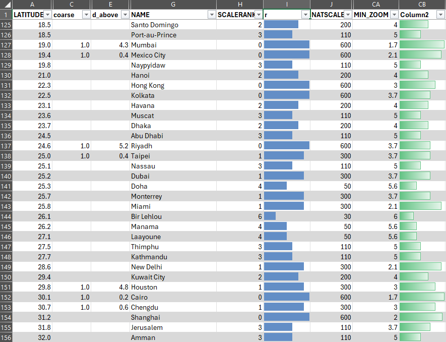
    Which cities should I include in the plot? To save me some time and be a little more scientific, I used a preexisting list of Populated Places, from Natural Earth. These data were prepared to be used as features on maps, so they have properties that allow a selection appropriate for different scales. Using the suggested selection of ("SCALERANK" ≤ 1 Or "FEATURECLA" = 'Admin-0 capital' Or "FEATURECLA" = 'Admin-0 capital alt'), gives 243 cities to choose from. I put everything on a spreadsheet and manually selected our “stops”, trying to space them out by around 4–5 degrees. This is what it looked like:

    Another consideration was that I wanted to have a mix of places from various continents. The plot should be interesting because it puts cities of very different longitudes together one on top of the other. The grouping in my mind was roughly: “Americas”, “Africa / Middle East / Europe”, “Oceania / (Eastern) Asia”, which is apparent from the spreadsheet excerpt above. I tried to limit these “interchange” stops to places within a ~1.0 degree range, which is why I settled for Chengdu instead of Shanghai, for example.

    This longitudinal clustering gave me the idea of having the plot be three lines, one for each continental set, and the interconnections would link up these lines. But this would require a lot of extra effort, so eventually I settled for a simple single line representation. Maybe one day I will revisit the idea.

    After the shopping for cities was complete, it all lined up surprisingly well. While it’s still a somewhat arbitrary selection, I think my choices are quite defendable. The only really biased choice was to go for my small hometown of São Paulo instead of the wretched hive of scum and villainy that is Rio de Janeiro, for some reason more favored by the “MIN_ZOOM” gods. But São Paulo has a special thing going for it though, latitudinally-wise: the Tropic of Capricorn (currently) passes over it. I remember being on a road trip when I was a kid and my dad jokingly telling us to duck because we would cross the line. It wasn’t necessarily a special moment, but for whatever reason it is a random fragment of memory that I’ve kept.

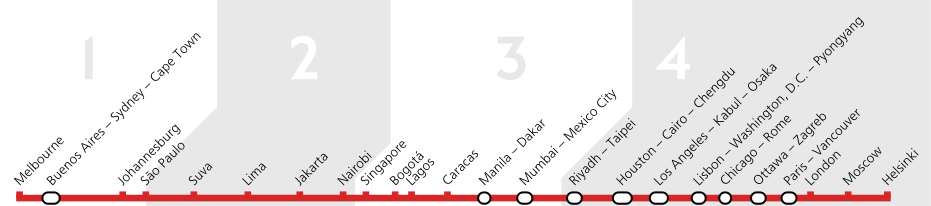
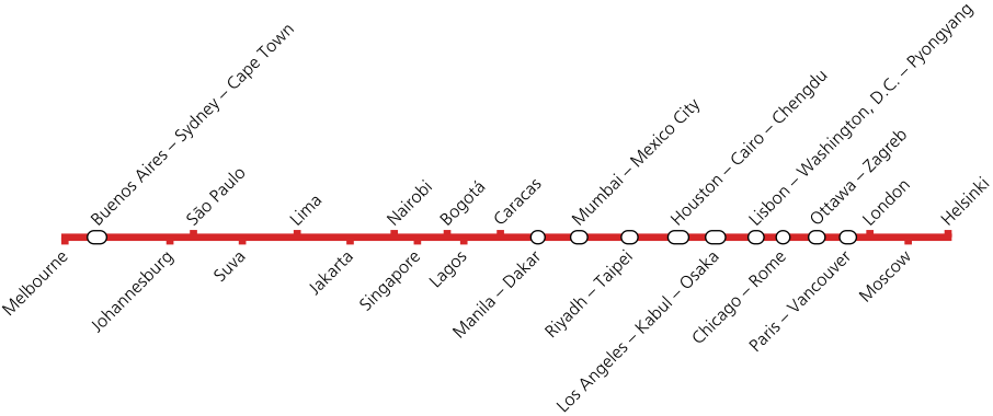
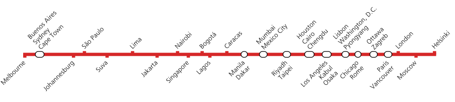
    In the end, I chose 38 cities for 24 stops, 10 of which were “interchanges”. You can see them below. Also, heads up, Suva is the capital of Fiji. Not that I needed to look that up, but I figured maybe you didn’t know that beforehand.

    How to draw a line

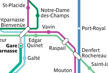
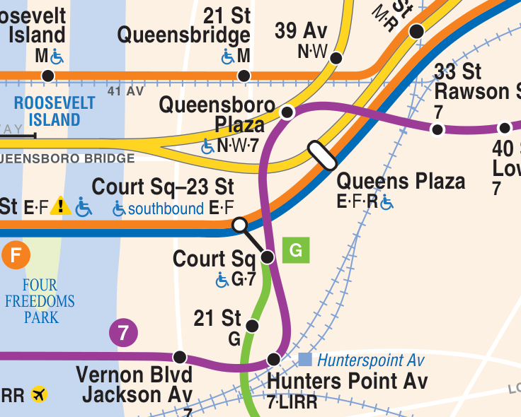
    Before I set about making the diagram, I first had to figure out what such a thing actually looks like. We can all image a metro line diagram in our heads, but if you actually put a few of them side by side, you’ll realize there’s quite a range of styles to choose from.

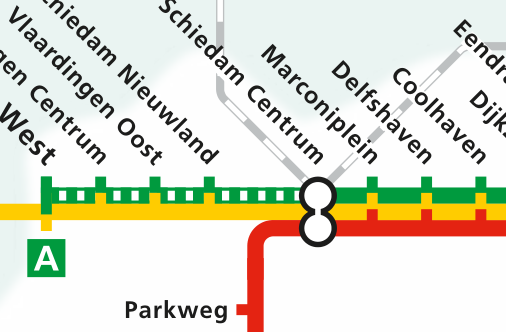
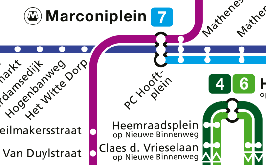
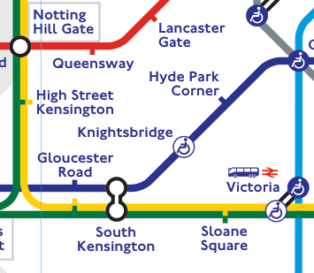
    Taking into account the specifics of our line, the easiness of recreating each style, the home bias I have for the Rotterdam Metro, and my personal preferences, I decided on the line’s format. It would basically be an imitation of the Rotterdam Metro, with notches denoting simple stops and white circles/pills with a black edge denoting interchanges. The line should be red because that is the line I take 4+ days a week.

    As an extra, I thought of grouping the line into distinct sections by way of indicating the location of the tropics and the equator. The cute solution I found for this was to pretend each group was a transit zone, which could be done following the style of the London Underground’s map.

    In recreating these styles, I ended up going down a calligraphic rabbit hole. Long story short, the font for the city names looks similar to what NS uses, while the zone numbers are similar to what is used in the Tube. And by “similar” I mean I might have copied those fonts from their website, or I might have licensed them, who’s to say. Relatedly, if you were looking for a gift for me, this watch is a perfectly acceptable option.

    The plot

    One thing I quickly realized was that a horizontal line with text at 45° was a more manageable layout. Fitting the text of multiple-city stops was a bit challenging, but in the end I chose to do everything in a single line, without alternating sides, so as to better align with the markers. Below are some alternatives that didn’t quite work as well:

    Speaking of markers, I learned how to hand-make them in Matplotlib:

    import matplotlib.path as mpath
    h = 1.0
    rect_up = mpath.Path(
        [[-0.5, 0], [0.5, 0], [0.5, h], [-0.5, h], [-0.5, 0]],
        [mpath.Path.MOVETO, mpath.Path.LINETO, mpath.Path.LINETO, mpath.Path.LINETO, mpath.Path.CLOSEPOLY]
    )

    The markers for the big stops are pill-shaped, defined by circles positioned at the latitude of each city in the stop. If the cities had exactly the same latitude, the marker would be a perfect circle. My solution for these variable-length markers was to actually make them as a white line in front of a larger black line, both with rounded caps:

    for t in stations_m1_multi:
        x1 = df.loc[t[0]]['LATITUDE']
        x2 = df.loc[t[-1]]['LATITUDE']
        ax.plot([x1, x2], [0, 0], c='k', lw=10, solid_capstyle='round', zorder=2)
        ax.plot([x1, x2], [0, 0], c='w', lw=7, solid_capstyle='round', zorder=3)

    The zones were also artisanally designed by specifying coordinates for the polygons to be filled. They had to go diagonally at first to align with the text, but everything lined up nicely. Sadly, however, I couldn’t find a good solution to indicate that the transit zones represent Southern/Northern temperate/tropical zones. Adding latitude values or labels like “Tropic of Cancer” seemed to take away from the simplicity of the diagram. It didn’t help that there aren’t good abbreviations or symbols for “tropic” and “equator”. So the “1-2-3-4” might be a bit cryptic, but then again, the whole figure only makes sense if you understand its context.

    And so at last, the final plot, in all of its glory:

    Oh, if only this was an actual train line, my parents would be just three trains away right now… You know, because I guess I didn’t bother putting Rotterdam itself on the line. But they would still need to take the Metro here, since I don’t live near the train station.