(not to be confused with a line of latitude)
Long winding intro
You don’t quite appreciate the North Atlantic Current until you realize that New York City is approximately at the same latitude as Madrid. The snowy, cold, northern city of Toronto has the same latitude as the sunny, pleasant, southern tax-haven port city called Monaco. Also, have you noticed that the majority of people in the Global South actually live in the North, in terms of the… globe, you know?
There are countless little unexpected factoids like these. Seattle is more north than Quebec City, and Paris is further north still. Tokyo is closer to the equator than Melbourne. Sapporo, one of the snowiest cities in the world, is also closer to the equator than Christchurch, where it barely snows.
So I thought it would be interesting to make a plot that discards all other dimensions and reduces cities to their latitude. The idea was to make a vertical line and put cities on it according to their latitude. This should be simple enough, and maybe it will highlight some of these interesting comparisons.
Eventually the idea evolved into making the plot as a transit line diagram, with a selection of large cities represented as “stops” on the line, spaced proportionally to their latitude. This presented an elegant solution to the problem of showing cities with similar values: they could be shown as sort of “interchanges” or “station complexes” in the diagram.
In my experience, a diagram of a single transit line becomes hard to parse visually after ~20 stops, which I’m rounding up to 25 (hey, it’s rounder in base 5). We have about 105 degrees to cover from Wellington to Reykjavik, which means a stop every 4 or 5 degrees. Using the standard conversion rate of 1 degree = 1 km, you can even imagine yourself traveling on a train crossing all those cities in a couple of hours. It used to be faster, but they have to do corrective maintenance on the tracks, sorry.
Next, I will describe which cities and which style to use. Then, the final result.
Ranked competitive ekistics
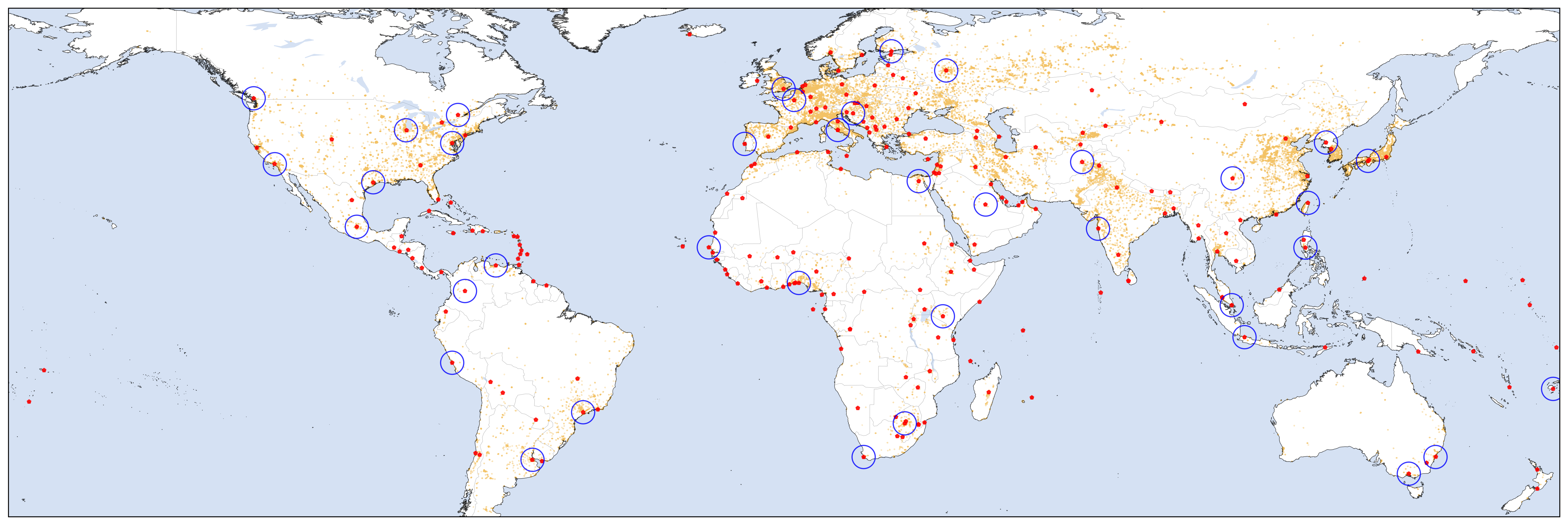
Which cities should I include in the plot? To save me some time and be a little more scientific, I used a preexisting list of Populated Places, from Natural Earth. These data were prepared to be used as features on maps, so they have properties that allow a selection appropriate for different scales. Using the suggested selection of ("SCALERANK" ≤ 1 Or "FEATURECLA" = 'Admin-0 capital' Or "FEATURECLA" = 'Admin-0 capital alt'), gives 243 cities to choose from. I put everything on a spreadsheet and manually selected our “stops”, trying to space them out by around 4–5 degrees. This is what it looked like:
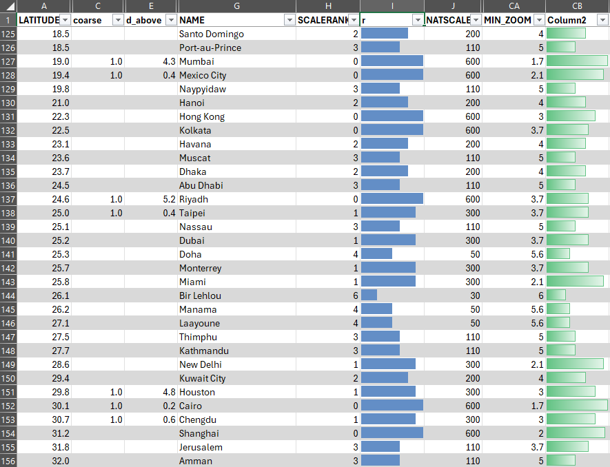
Another consideration was that I wanted to have a mix of places from various continents. The plot should be interesting because it puts cities of very different longitudes together one on top of the other. The grouping in my mind was roughly: “Americas”, “Africa / Middle East / Europe”, “Oceania / (Eastern) Asia”, which is apparent from the spreadsheet excerpt above. I tried to limit these “interchange” stops to places within a ~1.0 degree range, which is why I settled for Chengdu instead of Shanghai, for example.
This longitudinal clustering gave me the idea of having the plot be three lines, one for each continental set, and the interconnections would link up these lines. But this would require a lot of extra effort, so eventually I settled for a simple single line representation. Maybe one day I will revisit the idea.
After the shopping for cities was complete, it all lined up surprisingly well. While it’s still a somewhat arbitrary selection, I think my choices are quite defendable. The only really biased choice was to go for my small hometown of São Paulo instead of the wretched hive of scum and villainy that is Rio de Janeiro, for some reason more favored by the “MIN_ZOOM” gods. But São Paulo has a special thing going for it though, latitudinally-wise: the Tropic of Capricorn (currently) passes over it. I remember being on a road trip when I was a kid and my dad jokingly telling us to duck because we would cross the line. It wasn’t necessarily a special moment, but for whatever reason it is a random fragment of memory that I’ve kept.
In the end, I chose 38 cities for 24 stops, 10 of which were “interchanges”. You can see them below. Also, heads up, Suva is the capital of Fiji. Not that I needed to look that up, but I figured maybe you didn’t know that beforehand.
How to draw a line
Before I set about making the diagram, I first had to figure out what such a thing actually looks like. We can all image a metro line diagram in our heads, but if you actually put a few of them side by side, you’ll realize there’s quite a range of styles to choose from.
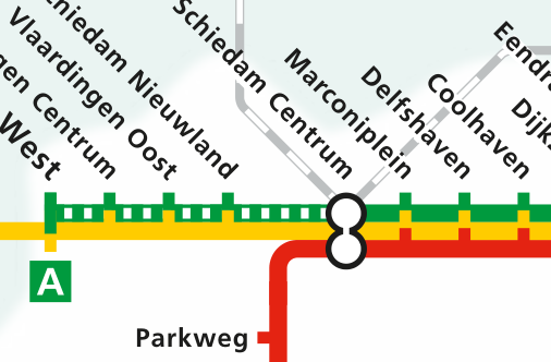
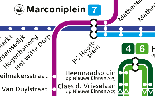
Taking into account the specifics of our line, the easiness of recreating each style, the home bias I have for the Rotterdam Metro, and my personal preferences, I decided on the line’s format. It would basically be an imitation of the Rotterdam Metro, with notches denoting simple stops and white circles/pills with a black edge denoting interchanges. The line should be red because that is the line I take 4+ days a week.
As an extra, I thought of grouping the line into distinct sections by way of indicating the location of the tropics and the equator. The cute solution I found for this was to pretend each group was a transit zone, which could be done following the style of the London Underground’s map.
In recreating these styles, I ended up going down a calligraphic rabbit hole. Long story short, the font for the city names looks similar to what NS uses, while the zone numbers are similar to what is used in the Tube. And by “similar” I mean I might have copied those fonts from their website, or I might have licensed them, who’s to say. Relatedly, if you were looking for a gift for me, this watch is a perfectly acceptable option.
The plot
One thing I quickly realized was that a horizontal line with text at 45° was a more manageable layout. Fitting the text of multiple-city stops was a bit challenging, but in the end I chose to do everything in a single line, without alternating sides, so as to better align with the markers. Below are some alternatives that didn’t quite work as well:


Speaking of markers, I learned how to hand-make them in Matplotlib:
import matplotlib.path as mpath
h = 1.0
rect_up = mpath.Path(
    [[-0.5, 0], [0.5, 0], [0.5, h], [-0.5, h], [-0.5, 0]],
    [mpath.Path.MOVETO, mpath.Path.LINETO, mpath.Path.LINETO, mpath.Path.LINETO, mpath.Path.CLOSEPOLY]
)
The markers for the big stops are pill-shaped, defined by circles positioned at the latitude of each city in the stop. If the cities had exactly the same latitude, the marker would be a perfect circle. My solution for these variable-length markers was to actually make them as a white line in front of a larger black line, both with rounded caps:
for t in stations_m1_multi:
    x1 = df.loc[t[0]]['LATITUDE']
    x2 = df.loc[t[-1]]['LATITUDE']
    ax.plot([x1, x2], [0, 0], c='k', lw=10, solid_capstyle='round', zorder=2)
ax.plot([x1, x2], [0, 0], c='w', lw=7, solid_capstyle='round', zorder=3)The zones were also artisanally designed by specifying coordinates for the polygons to be filled. They had to go diagonally at first to align with the text, but everything lined up nicely. Sadly, however, I couldn’t find a good solution to indicate that the transit zones represent Southern/Northern temperate/tropical zones. Adding latitude values or labels like “Tropic of Cancer” seemed to take away from the simplicity of the diagram. It didn’t help that there aren’t good abbreviations or symbols for “tropic” and “equator”. So the “1-2-3-4” might be a bit cryptic, but then again, the whole figure only makes sense if you understand its context.
And so at last, the final plot, in all of its glory:

Oh, if only this was an actual train line, my parents would be just three trains away right now… You know, because I guess I didn’t bother putting Rotterdam itself on the line. But they would still need to take the Metro here, since I don’t live near the train station.
Leave a Reply